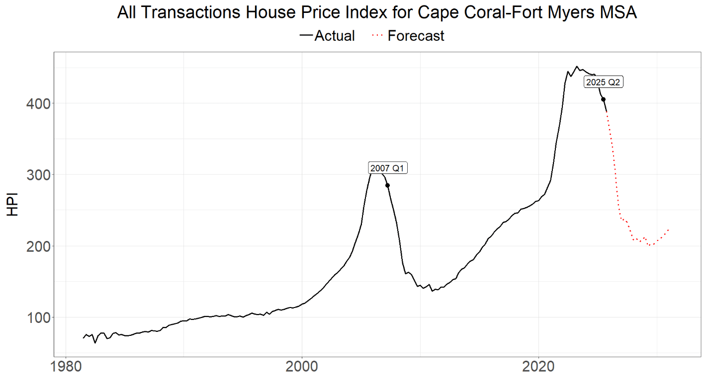
Since their peak in Q2 2023, home prices in the Fort Myers MSA are down about 10%.1 This made us wonder how mortgages would perform if prices continued their downward trend, like they did during the crisis? So, we built models and forecasted losses if future home prices follow the 57% total decline experienced from late 2006 to late 2011, and then compared our projected losses against those realized by the 2007 pre-crisis portfolio.
Besides the recent decline in home prices, other factors indicate that the market is already weak. For example, Bloomberg recently reported that private credit firms are facing severe delinquencies from “flippers” in Cape Coral; most of these borrowers seem to be small, amateur “spec” home developers and not actually remodelers.2
Moreover, throughout Florida, property and flood insurance premiums have risen sharply since 2018. Indeed, Fort Myers was hit by both Hurricanes Irma (2017) and Ian (2022) and saw large increases in premiums, and for certain properties large increases in HOA fees, too.
Other home ownership costs are rising more than the rate of inflation. For example, in Punta Gorda, water utility rates will increase 12% per year for each of the next four years.
A Historical Scenario
We are not predicting that home prices will follow that downward path. We’re simply performing a historical scenario analysis by asking, “What if?” they did.
What We Did
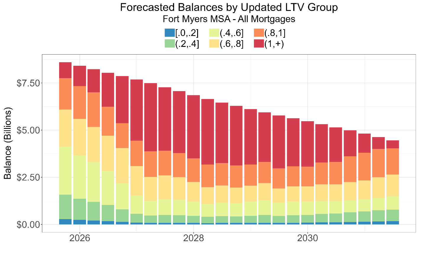
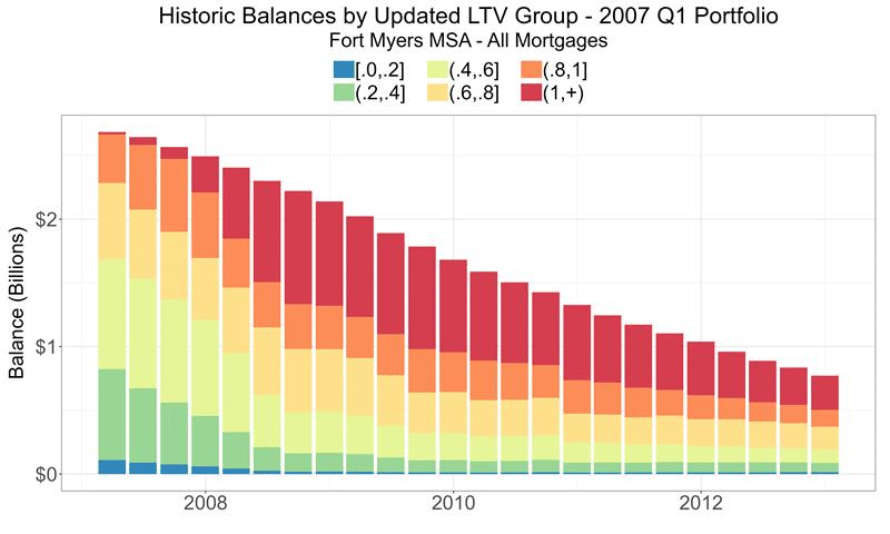
We analyzed Fannie Mae mortgage data for the MSA; built reasonable probability of default (PD), loss given default rate (LGD), and prepayment models (to generate future balances); and estimated losses, just like one would do in a bank stress testing exercise. To compare the crisis and the present-day, we fixed the pre-crisis portfolio at Q1 2007 and the current portfolio at Q2 2025, which was the latest available dataset when we started the project. In both cases, home prices were/are already down about 10% from their previous peaks; so, in our forecast, we decrease future home prices another 47% from their 2023 peak values.
The Results
Our forecasted cumulative loss rate of 8.44% over the next six years is lower than the realized Q1 2007 rate of 10.3% over a similar time horizon, but on a portfolio 3.2 times larger in dollar terms estimated losses are substantially greater: $688M versus $270M in the crisis.3
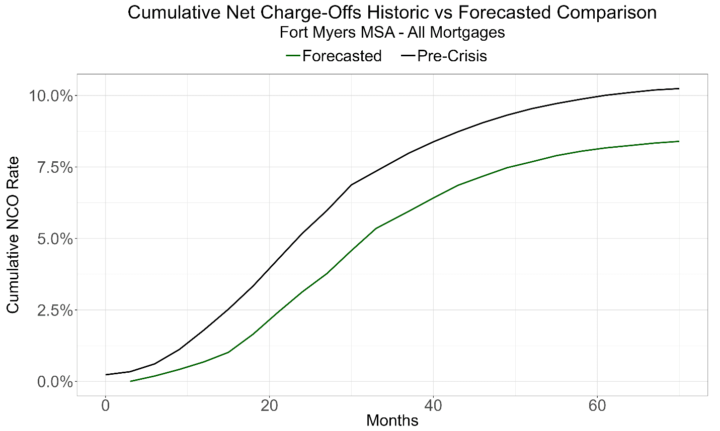
Note also that CCAR stress-testing exercises for banks have horizons of nine quarters (27 months), but 27 months only captured about 60% of historical losses and about 40% of our forecasted losses; below, we’ll explain why forecasted losses occur later this time. (To get an accurate estimate of possible losses, banks may want to consider lengthening their horizons since their portfolios share many of the same characteristics as Fannie’s.)
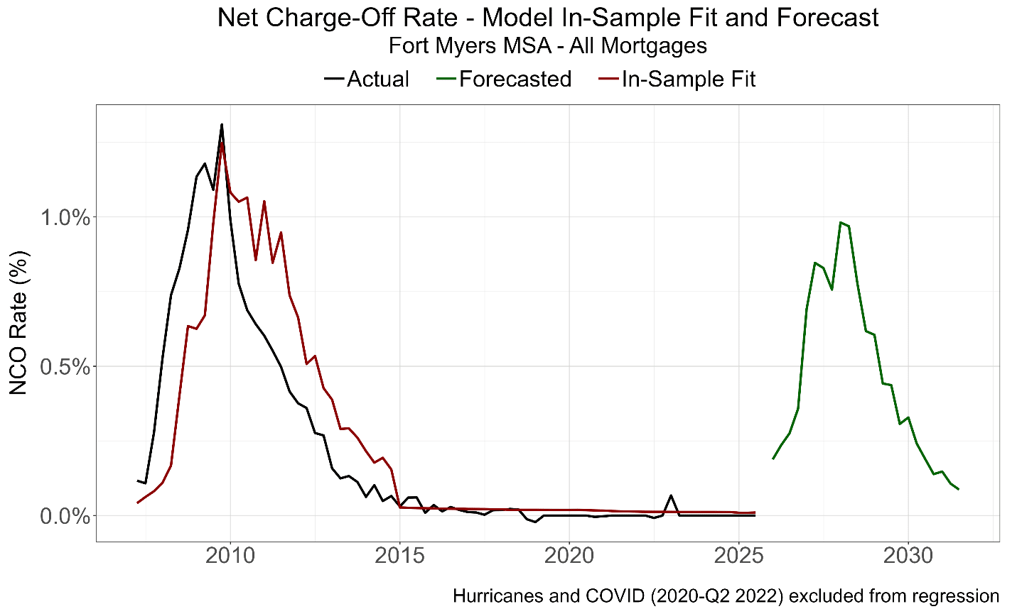
Our regression models are built on Fannie’s available sample history, which started in 2000, minus observations during hurricanes and covid. The following graph shows quarter-by-quarter loss rates for our two portfolios.4
See our analysis of hurricanes for why they should be excluded from model samples.
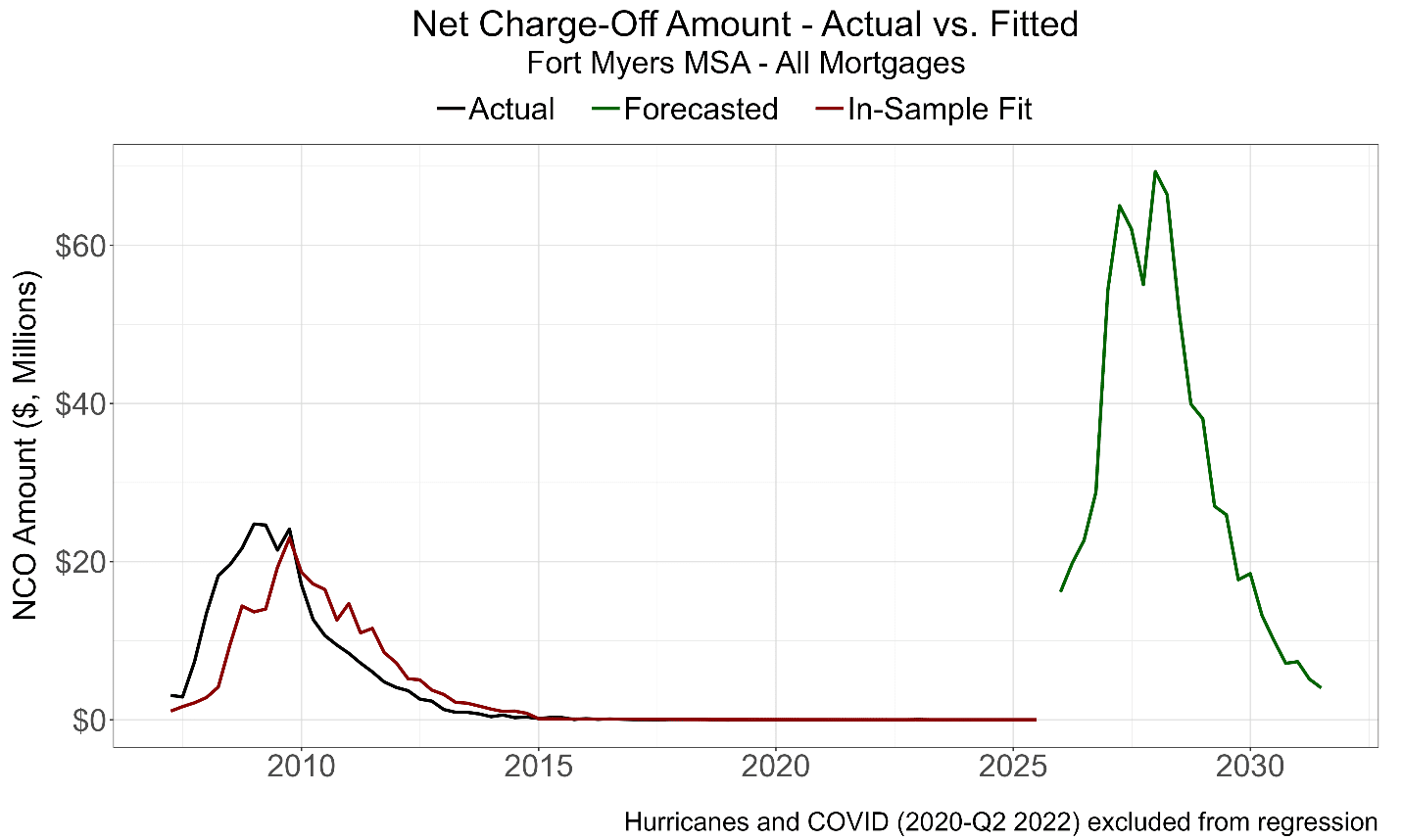
It is worth noting that while our estimated loss rates are lower than in the crisis, estimated loss dollars are substantially greater since the portfolio is 3.2 times larger today than in 2007: forecasted to be about $688 million.
Why Fort Myers?
Analyses
The reader might ask, “Given the post-crisis tightening of underwriting standards, shouldn’t forecasted loss rates be a lot lower and not just 18% lower?” Let’s explore the factors that matter.
FICO Scores
It is true that the distribution of origination FICO scores is better today than in 2007. In 2007, about 30% were below 700; only about 12% are today.5Given changes in methodologies and scoring models through time, scores from 20 years apart aren’t necessarily comparable, but it would be unreasonable to conclude that, based on FICO alone, 2025’s borrowers are less creditworthy than the 2007 cohort.
We don’t have updated FICO scores at the portfolio date.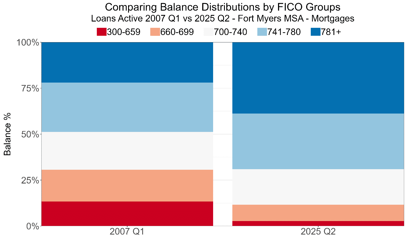
DTIs
It is much harder to say that the distribution of origination Debt-to-Income (DTI) ratios is better today than in 2007.
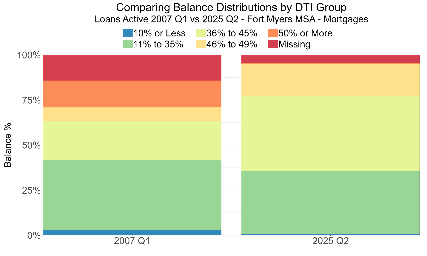
A DTI under 35% is generally considered desirable, and only 35.5% of borrowers today have a ratio below that value versus 42.0% in 2007.
While no borrower has a DTI above 50% today, the percentage of borrowers with DTIs above 40% is roughly the same as in 2007. (For both portfolios, if a borrower’s DTI is missing, we add it to the >50% group.)6 Like FICO scores, we have only DTIs at origination (and BTW, that’s almost always the case for DTIs). Given the large increases in insurance premiums and HOA fees in the market, updated DTIs in 2025 would likely be worse than at most loan’s origination: holding income constant, of course. For the 2007 portfolio, there weren’t similar increases in these required payments from loan acquisition to its portfolio date, and while we can’t model and forecast the effects of these increases, we know they’re not a good thing.
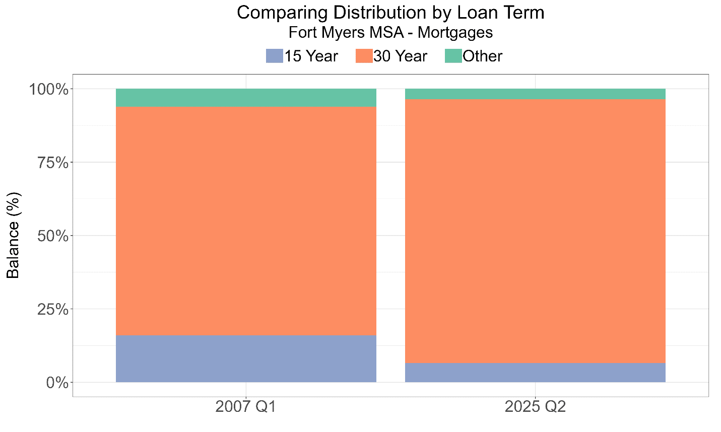
Loan Terms
Conventional loans can have different maturities, and 30-year loans default at much higher rates than 15-year or other shorter-term loans. 90.0% of today’s portfolio has 30-year terms versus 78.0% in 2007. This substantially increases the risk of default and the amount lost if a default were to occur. So, on this dimension, there’s more potential for loss, today.
LTVs
In a default, the loan’s balance relative to the home’s value is a key determinant of how much could be lost. With increasing or stable prices, defaults frequently generate no losses. For example, industry-wide, banks have had zero or negative net charge-offs since 2018.7 However, with substantial home price declines, high loan-to-value ratios (LTVs) correlate with greater chances of default as well as greater losses given default. Loss rates grow rapidly as LTVs increase.
Why is that a problem? Because, like loan terms, the distribution of both origination and updated LTVs is worse today than in 2007.
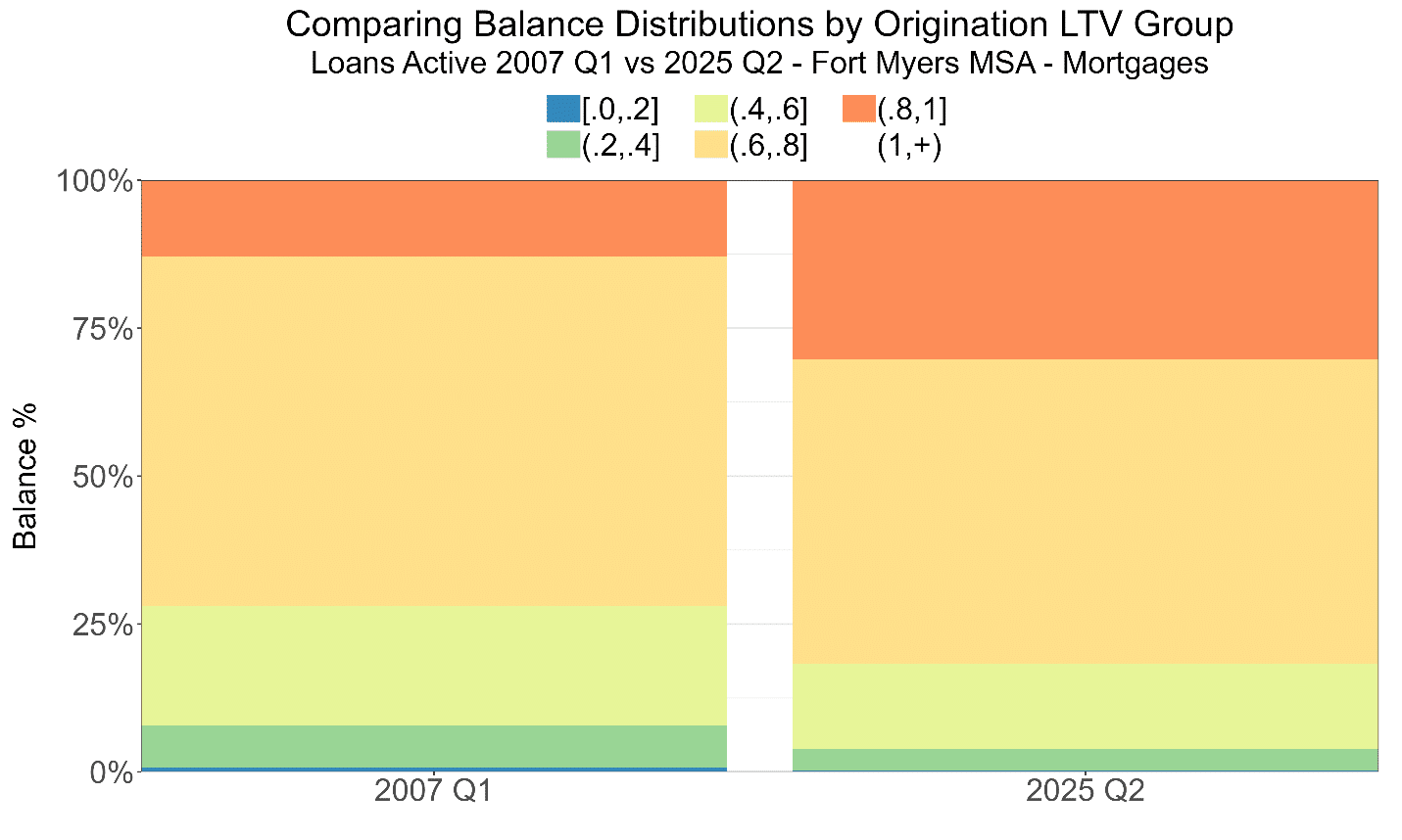
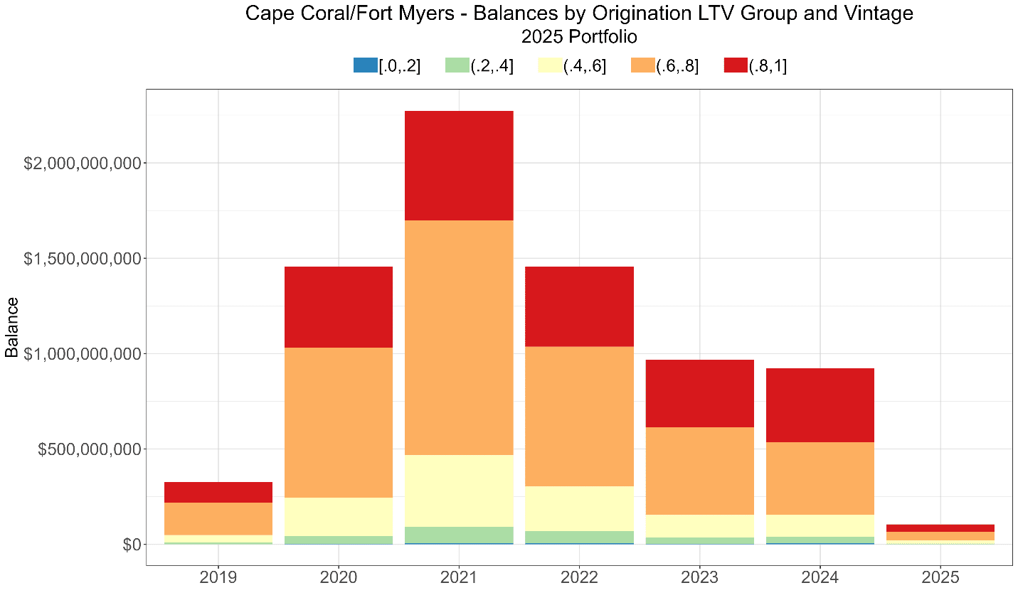
Increased origination LTVs might be somewhat surprising given the rapid and large increase in home prices shown in Graph 1, but higher prices and higher leverage tend to go hand-in-hand.
It shouldn’t be surprising, given the worse starting position (in Graph 6a) and similar price declines from the peak to the portfolio date, that updated LTVs are worse today. In fact, 25% of the loans have a current LTV above 80%, and almost half of the portfolio has an LTV above 60%. If prices declined another 47% from peak, all loans in these segments would be “underwater” (i.e., have LTVs above 100%), and that’s where the risk really magnifies.
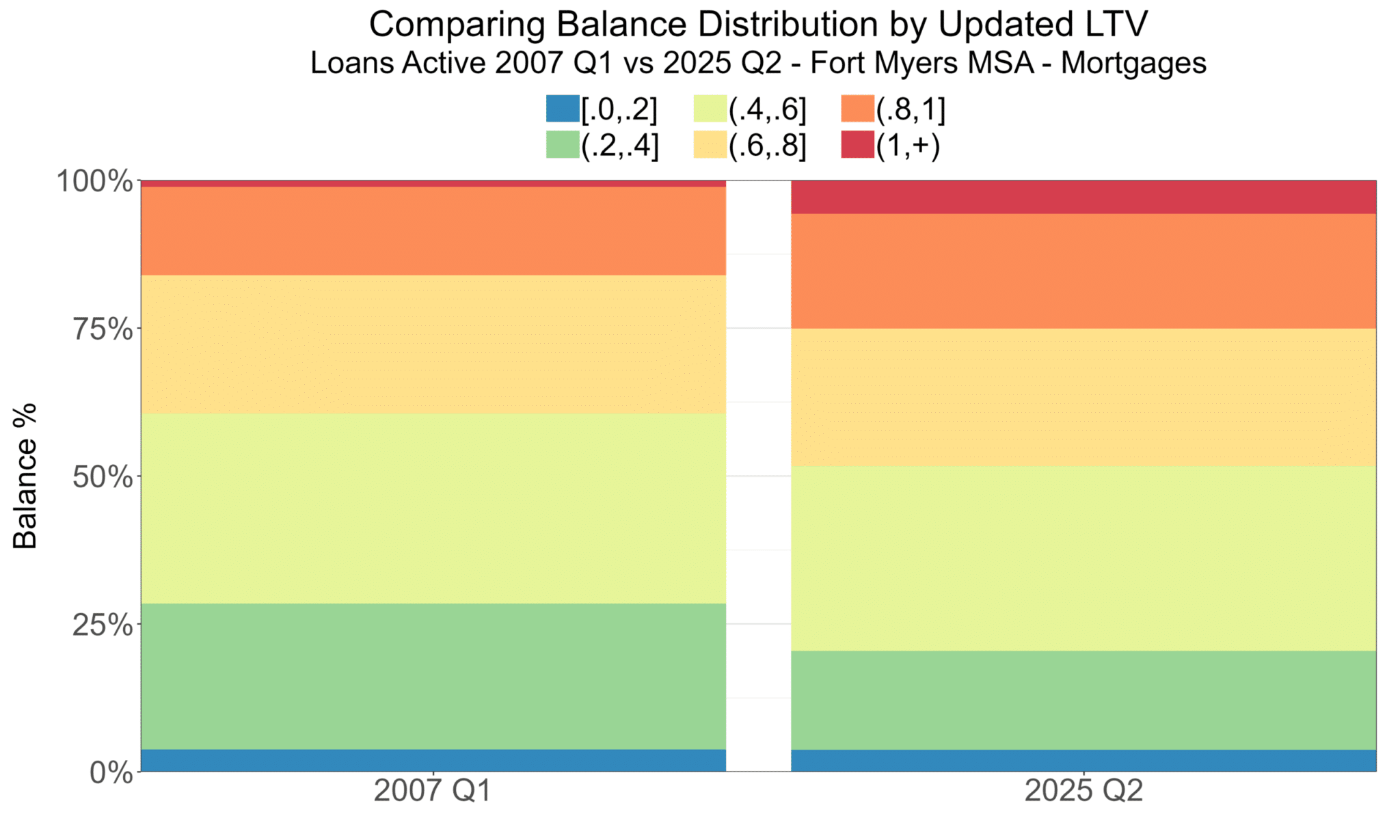
To reiterate, if the price history repeats itself, then in the worst quarter of our forecast, 49.6% of loans will be underwater, which is 15% worse than during The Crisis, and it’s never good to be worse than (something called) The Crisis!
For the same total price decline, why do forecasted LTVs look worse than what was observed in the crisis? (The Crisis! for goodness sakes!) Well, for two reasons:
- As Graph 6b shows, starting LTVs are already higher.
- More of today’s portfolio originated nearer to recent peak home price levels than was the case with the pre-crisis portfolio. So, a forecasted decline in peak prices would negatively affect (already high) LTVs–make them bigger–more than the actual price drop did to LTVs during the crisis. The same percentage drop in prices puts more of today’s portfolio in the danger zone of very high LTVs.
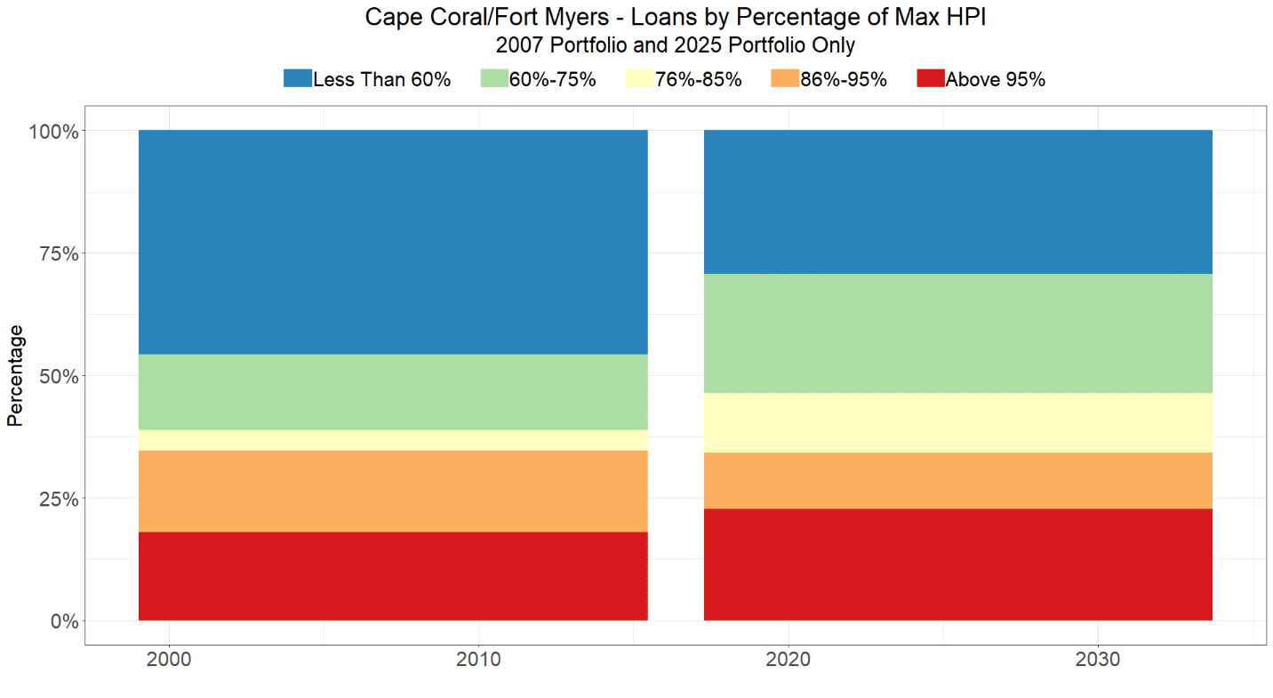
Almost 25% of today’s portfolio was booked when home prices were within 5% of the peak. Moreover, about 75% were booked at prices within 40% of the peak. Every 20%-down loan made during covid (with limited early-year amortization and minimal partial prepayments) would be underwater in a repeat of the crisis HPI path.
Here’s the problem and the compounding factor: loans made at-of-near-the-price-peak tend to have the highest leverage, too.
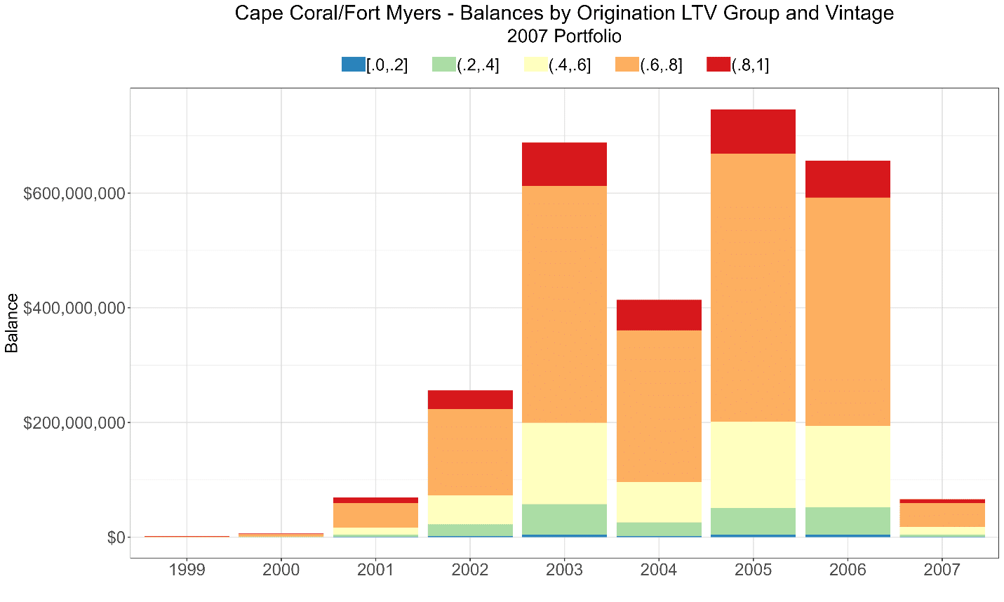
A quick comparison of the two graphs shows that proportionally more of the 2007 portfolio was put on at lower leverage (and at lower prices relative to the peak), but even at those levels, losses were terrible.
To understand the risk associated with that, let’s take an extreme example. This isn’t an attempt at scaremongering, but such cases would likely be observed if home prices crashed.
In the worst quarter, after a 57% price decline, a 20%-down loan (with an original LTV of 80%) made at the peak price level would have an updated LTV of 80 ÷ (1 − 57%) = 186%, assuming no amortization, and assuming that it survived that long and didn’t default as LTVs rose. In fact, every 20%-down loan made when HPI was more than 54% of the peak level would be underwater (again ignoring amortization and partial prepayments) at the market’s bottom.
After building many, many loss-forecasting models for mortgages (and other secured loans), we know that losses are increasing and convex in updated LTVs.
So, while it is true that underwriting standards are stricter than they were pre-crisis, and those standards may be sufficient on average, when prices and loan volume increase sharply, leverage tends to increase, too. (And, increasing leverage increases home prices…) Those highly-leveraged loans are the riskiest in a nonlinear way; so, constant lending standards might not be sufficient at the margin, particularly in the frothiest markets. In fact, since the historical and forecasts cumulative loss rates aren’t that different, it seems that tighter borrower requirements after the crisis barely compensate for the increased risk from the leverage that exists today.
The upward spiral of prices and leverage isn’t a new phenomenon, and we’ve advised clients that when collateral values reach unprecedented levels, lending standards should be tightened (e.g., the maximum acceptable LTV should be lower), to no avail, of course. Such an approach requires tremendous discipline to tap the brakes when the good times are rolling.8
There’s another reason why risk is amplified when a significant portion of the portfolio originates at-or-near unprecedented high values. To achieve those values, interest rates need to be low, and rates during covid were extremely and ahistorically low. Interest rates were never lower than when the bulk of today’s high-priced, high-LTV portfolio was acquired. There were record sales, refinancings and cash-out refinancings. (Compare Graphs 9a and 9b and notice that today’s portfolio at the date of record is older than 2007’s This is one of the flaws the time-on-book approach to modeling.)
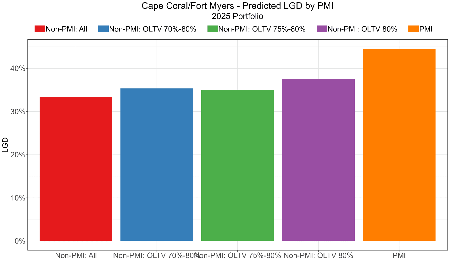
The reader might wonder: “So, all loans originated at greater than 80% LTV require private mortgage insurance (PMI). Doesn’t that make your argument fall apart?”
Well, no actually. PMI isn’t like an FHA loan in which 100% of the balance is insured. PMI coverage ranges from 6% to 35% of the LTV and other factors (and 35% PMI for a 3%-down loan won’t cover losses if a property is foreclosed at 43% of its initial sales price). In fact, as the graph below shows, forecasted LGDs for PMI loans are higher than every other category. (Moreover, LTVs drive both default rates and LGDs, not just LGDs; so, PMI loans default more and lose more on average.)
Balances and Prepayment Rates
To estimate future loan balances we needed to determine the effects of forecasted prepayment rates, and that’s challenge given the unprecedented low rates of the early 2020s.
People relocate and sell their homes, and people prepay loans because they don’t want debt (and people die, etc.), and those events aren’t directly interest-rate driven. For everyone else with Fannie fixed-rate loans, the biggest external influence on prepayments is the difference between current available rate to the borrower and loan’s rate. (There is also less direct prepayment effect of market rates on home prices and the incentive to sell).
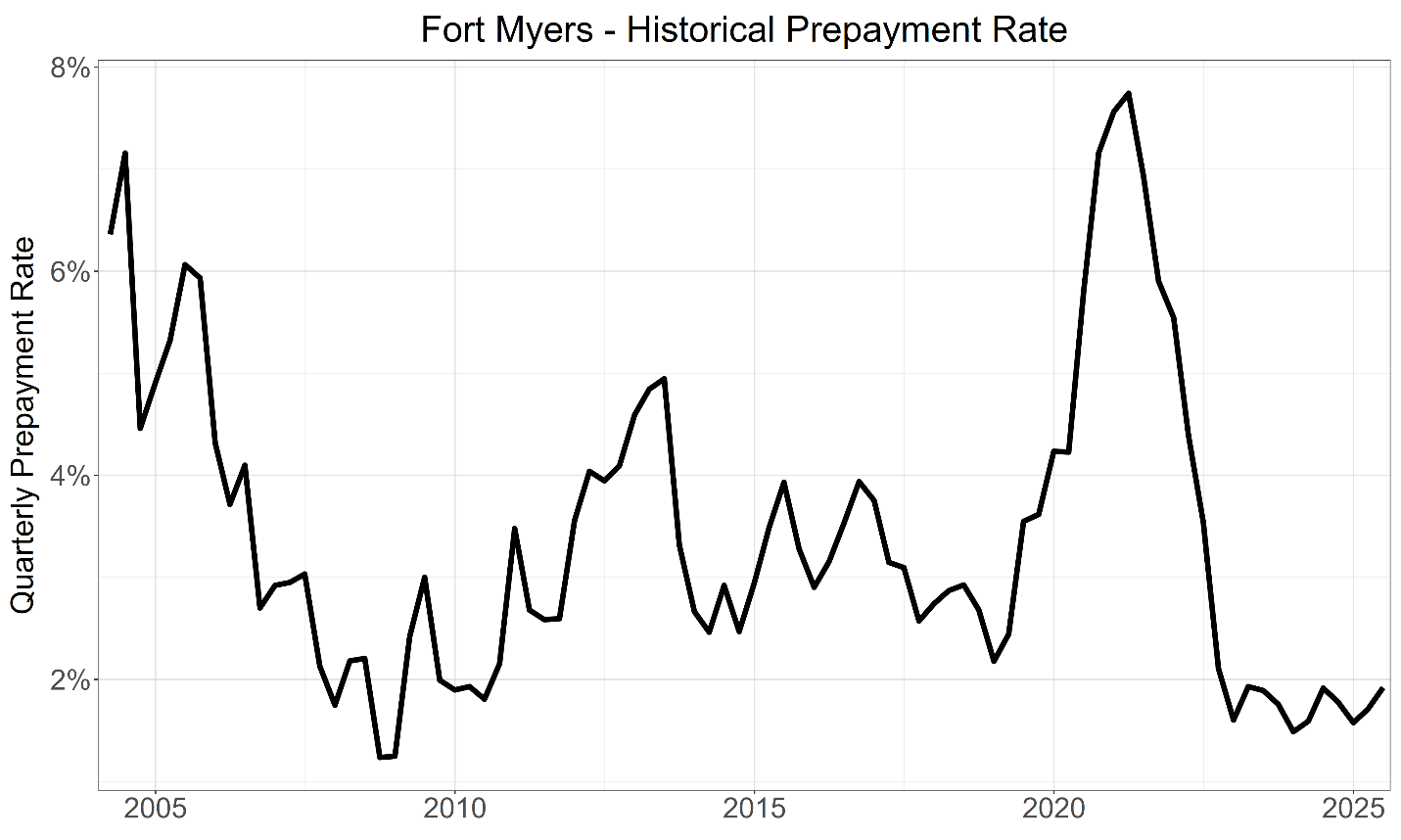
Covid-era rates were historically low, and as Graph 9a shows, those extremely low-rate vintages still comprise much of the portfolio. With home prices flat-to-decreasing, and market rates much higher than origination rates, there is little incentive to prepay. In fact, recent average prepayment rates in Fort Myers are near historic lows even without a crisis! (Prepayment rates cratered during the actual crisis for a variety of reasons, including the fact that many loans were underwater, i.e., LTV > 100%.)
Now, why are recent prepayment rates so low? Consider where the market rates are compared to each loan’s rate.
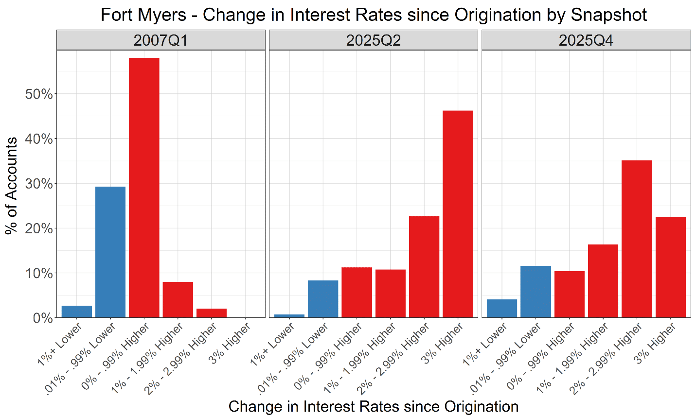
In 2007, most of the portfolio’s loans were near the then current market rate. In fact, the left panel of Graph 12 shows that only 10% of the loans–the two red bars to the right–were far from having an incentive to refinance. The current rate was at least 100 basis points (bps) above those loans’ rates. So, when market rates dropped 200 bps, practically everyone had an incentive to refinance. Of course, given that it was a financial crisis, many weren’t in a position to take advantage of the lower rates. Only 2% of the loans required the market rate to drop more than 200 bps to provide an incentive to refinance, and barely any loans needed a 300 bps drop in the market rate.
Now, compare that to the 2025 portfolio: about 80% of today’s portfolio has no incentive to refinance unless rates drop more than 100 bps below the current rate, and even with the recent reduction in rates, that percentage has remained relatively constant. 23% of the portfolio needs rates to drop at least 200 bps to refinance for rate reasons, and a whopping 45% need rates to drop at least 300 bps, i.e., lower than covid-era levels. So, rates would have to decrease a lot for much of the current portfolio to have an incentive to refinance. And of course, the ability to refinance drops when home values decrease and unemployment rises.
Consider a scatter plot of the difference in rates since origination–the horizontal axis–and prepayment rates. (We’re flipping the horizontal axis, so higher market rates are on the left.) When market rates greater than or equal to the contractual rate, prepayments are relatively constant, i.e., there’s a slight upward slope as the difference narrows to the left of 0%. On the right, when the market rate is less than the contractual rate, the incentive to refinance increases sharply as the difference increases (holding all other factors, like creditworthiness, constant, of course).
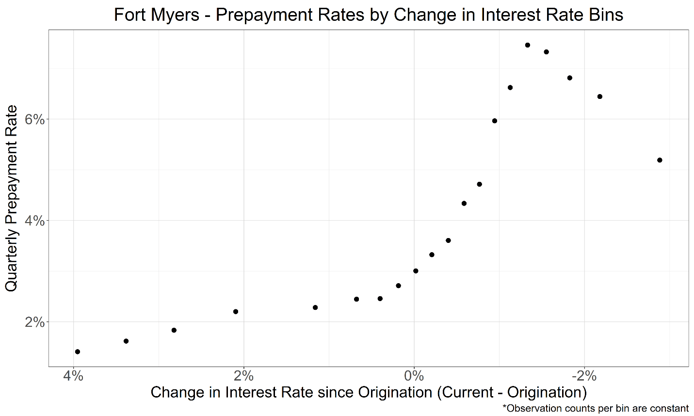
Recall from Graph 2 that our forecasted losses occur later in the horizon than during the Crisis. That’s because non-defaulted balances stay relatively higher because lower forecasted prepayment rates because of less incentive to refinance. As the two panels on the right of Graph 12 show, today, almost everyone falls on the left side of the scatter plot, and that would remain true, even with further rate cuts.
To avoid scaremongering or overstating expected losses, we built our prepayment models conservatively. In fact, our hunch is that if something like the crisis were to re-occur, our models would overstate forecasted balance declines; so, our estimated losses would be lower than actual losses, which could be closer to the 10.3% realized by the Q1 2007 portfolio. Of course, we can only verify that hunch with another crisis.
Qualitative Adjustments
Beyond the quantitative models, several qualitative factors should be considered.
Our models are built on Fannie’s historical database from 2000 to today. A lot happens in 25 years, but not everything. For example, we’ve never had a time when so many loans were booked at historically low interest rates.
Above, we’ve attempted to make the comparison between 2007 and today as clean as possible; however, like recent, ahistorical interest rates and their effect on prepayments, not all relevant factors can be modeled. Key factors we were unable to model include:
- As the Bloomberg article indicates, spec home building by amateurs seems more prevalent today than in 2007 and their plight seems worse, and we’re not even in a crisis.
- Property and flood insurance rates (and in some cases HOA fees) have increased substantially since 2018. Later vintages were booked after much of those increases were realized, but the updated DTIs of earlier vintages are likely higher than at origination.
- In certain communities, other costs of home ownership (e.g., water utility rates) are increasing, e.g., about 50% over the next four years.
- As you see from Graph 3, based upon origination FICO scores, Fannie has few if any subprime loans compared to 2007, but those loans haven’t gone away. They’re now FHA loans, and while FHA loans are fully insured, the implications of defaults and foreclosures on neighborhood and home prices are not. The FHA has much more market share than 20 years ago, and low FICOs, high DTIs, and extremely high LTVs (associated with 3% down) mean that in a severe downturn when unemployment spikes, home prices will crash, and there will be many, many foreclosures that will further destroy property values. When these loans are coupled with private credit’s loans (to even more dubious borrowers and properties) there’s the possibility of an even bigger sinkhole than last time.
- Fannie doesn’t buy adjustable-rate mortgages, but a decent number of those loans were made in the frothiest of covid lending times. Like subprime and high LTV loans, ARMs defaulted at substantially higher rates than fixed-rate mortgages last time. (See Freddie Mac or ask us for evidence.) Banks hold some of the new ARMs. So, if in a new crisis, ARMs behave like they did last time, foreclosures will increase, property values will decrease, and LTVs for Fannie’s loans will increase… leading to likely higher defaults and losses.
- We didn’t have online gambling and prediction markets last time. It’s hard to believe that those two “innovations” will enhance creditworthiness in good times or in a crisis.
Caveats
- We make no claims that these are the very best models possible (given the other constraints), but they’re certainly defendable.
- Fannie doesn’t provide updated FICO scores or updated DTIs, and updated DTIs are almost impossible to calculate because borrowers don’t report updated income. So, we can’t capture the deterioration of creditworthiness in a bad scenario. Relative to the crisis, given the increase in required payments like insurance premiums, updated DTIs would likely be worse today, and we’re probably understating expected losses. Given that most of the increase in insurance rates happened prior to 2024, we would anticipate that the updated DTIs of those earlier vintages would increase the most.
- Both historically and prospectively, we don’t know which properties may have second liens from home equity loans or lines of credit, and cumulative debt-to-value influences defaults, too.
- Florida’s population increased in 2006 and pretty much held steady in 2007. It didn’t begin to decrease until 2008. There are already reports that folks are leaving and want to leave the Fort Myers area. Population decreases generally don’t lead to home price increases. On the positive side, northeastern states seem to continue to want to increase taxes and drive citizens to no-income-tax states, like Florida.
- As with any loss-forecasting exercise, our conditional expectations exclude millions of real-world parameters. We think we captured the major ones. Let us know if you agree.
- fred.stlouisfed.org/series/ATNHPIUS15980Q
- bloomberg.com/news/features/2026-02-08/private-credit-loans-are-driving-foreclosures-in-the-home-flipping-market
- Nationally, home prices decreased almost 19%—a third of Fort Myers’ 57% drop—and Fannie lost ~$140B on its roughly $3T of single-family mortgages, or about 4.67%.
- See our analysis of hurricanes for why they should be excluded from model samples.
- Given changes in methodologies and scoring models through time, scores from 20 years apart aren’t necessarily comparable, but it would be unreasonable to conclude that, based on FICO alone, 2025’s borrowers are less creditworthy than the 2007 cohort.
- Our rationale is that if the record is missing, it is likely to be a high value.
- fred.stlouisfed.org/series/CORSFRMACBS
- And what would happen to quarterly earnings?