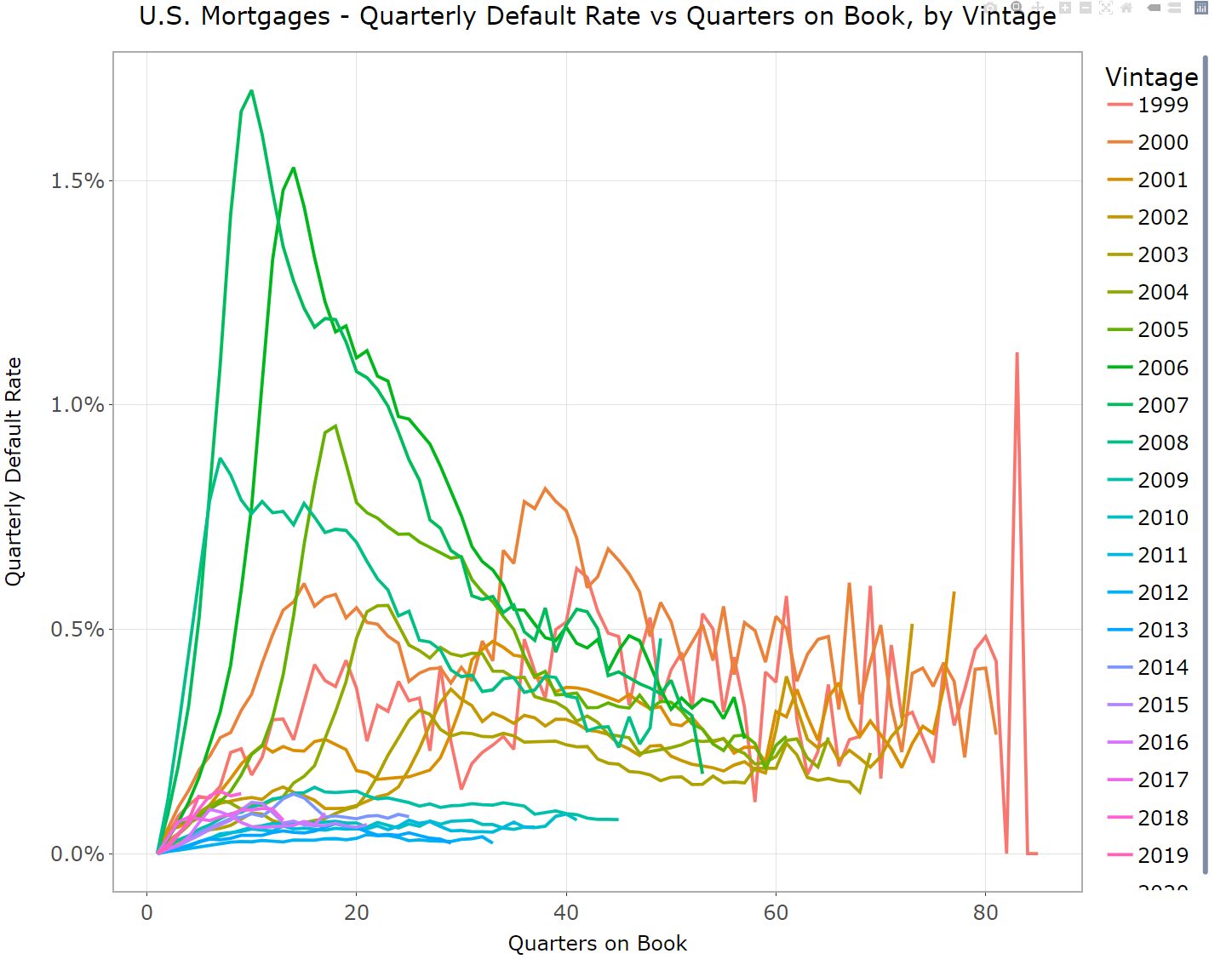
Through a series of graphs, we show that a mortgage seasoning curve—risk as a function of Time-on-Book (TOB)—is a vacuous predictive factor, and possibly a harmful one. TOB is a proxy for more fundamental factors that can be known and measured directly. Proponents who persist in using TOB for modeling and forecasting should realize that they can mislead others and, possibly, themselves.
Narrative Fallacies All the Way Down
Ask most credit modelers how mortgages default over their lives, and they’ll likely draw a curve that looks something like Graph 1.
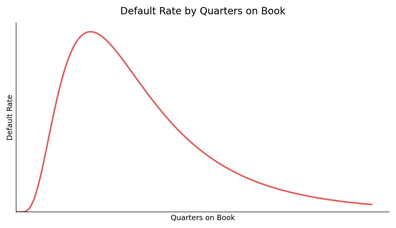
You’ll hear explanations like, “There are few defaults early and then the hump rises over the first couple of years as borrowers sort themselves out. Defaults peak somewhere around 18 to 24 months, and then gradually tail off…” “Except for fraud, new loans rarely default…” “Risk builds as the loans season before balances begin to decline… blah, blah, blah.” Those aren’t explanations. They’re just descriptions of the curve that people want to believe.
It’s all nonsense and a misreading of history. Have any vintages ever performed like Graph 1 shows? Yes, a few have, as we’ll show. Those vintages helped produce an average relationship, over short sample history, that has been projected or extrapolated to something much more general. Don’t be fooled.
Just about everyone who works in credit knows the curve. It’s frequently used in models for CECL and stress testing, acquisition pricing, etc. The default-age relationship gets treated as a fact of nature, but it’s not. So, before you rely on that curve to make any credit decisions or generate any forecasts, ask yourself: is the hump really a property of your loans, or just the way you’ve always drawn the picture because that’s the way others (either elders or vendors) drew the picture before you?
The default-loan age relationship fallacy is easy to illustrate with graphs based on publicly-available Fannie Mae mortgages.
Default Curves by Vintage
Pre-Crisis
Let’s look at TOB for pre-Crisis vintages (1999 – 2008, although we’re including 2009, too).
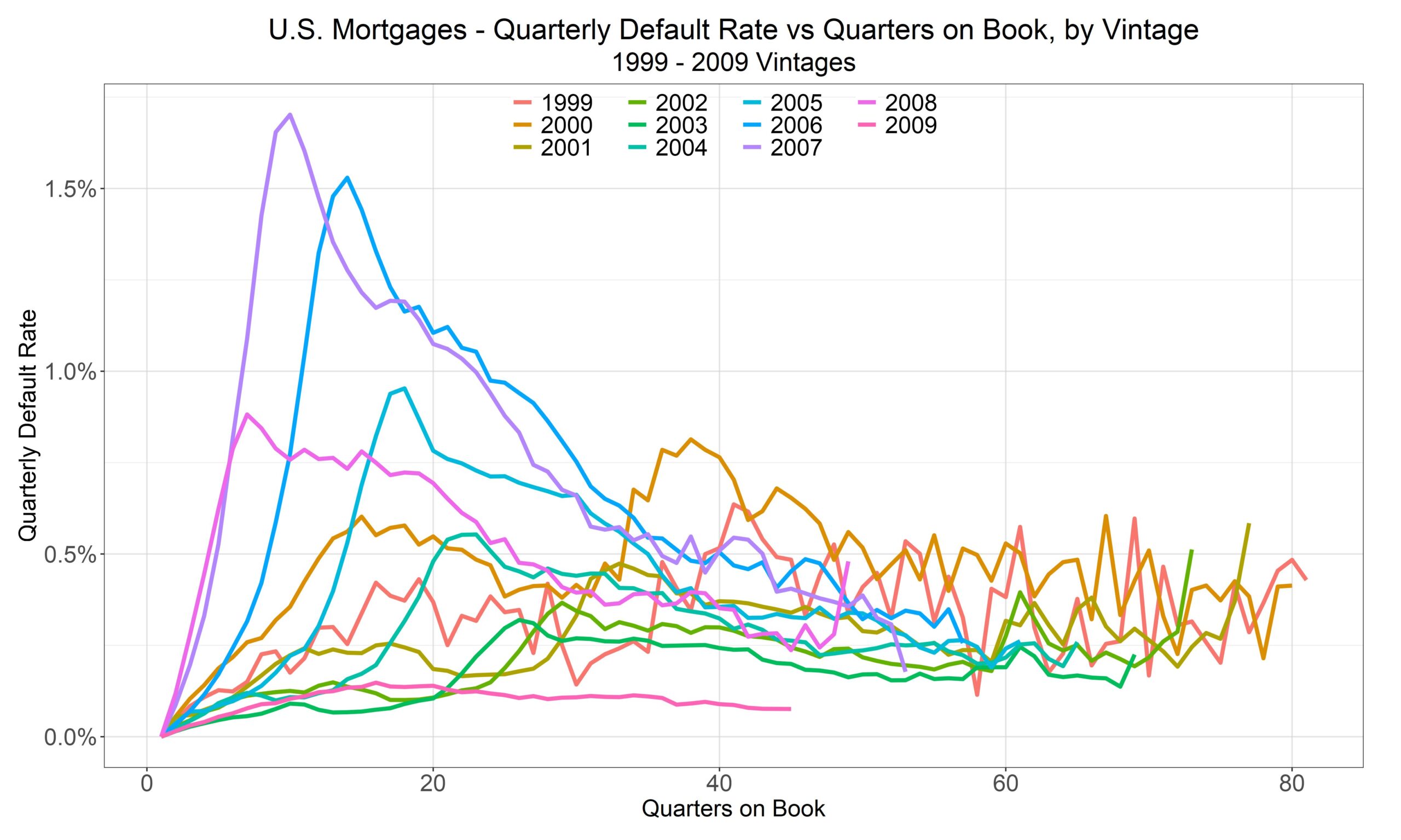
Now, the persnickety reader might say, “But, but, but look at those TOB vintage curves. They’re not much different from the curve you dismissed in Graph 1 as being fallacious. What gives?”
That’s one way to read it, albeit not a very good way. Look a little closer. What vintages have early, steep humps? Yep, 2006, 2007, 2008, and throw in 2005, if you want. Hmmm, what do those vintages have in common? What could it be? Could those be the worst vintages with the worst underwriting standards in (available) U.S. history (so far)? Their riskiness, alone, is insufficient to cause the hump… something had to happen for the risk to be realized as defaults (and losses).
Also, notice that in loan-age, quarters-on-book Graph 2, the peak defaults for none of those vintages coincide at the same age. 2005’s peak is four quarters older than 2006’s peak, which is four quarters older than 2007, which—no surprise here—is four quarters older than 2008’s peak.
We can see that clearly when considering the vintages’ quarterly default rates in calendar time, as Graph 3 shows. When do they all peak? Around 2009 and 2010. Does anyone who is reading this find that surprising? For goodness sakes! That period is called “The Crisis” or the “Great Financial Crisis.” Every vintage from 1999 to 2008 has its peak default rate in 2009 – 10 (so far).
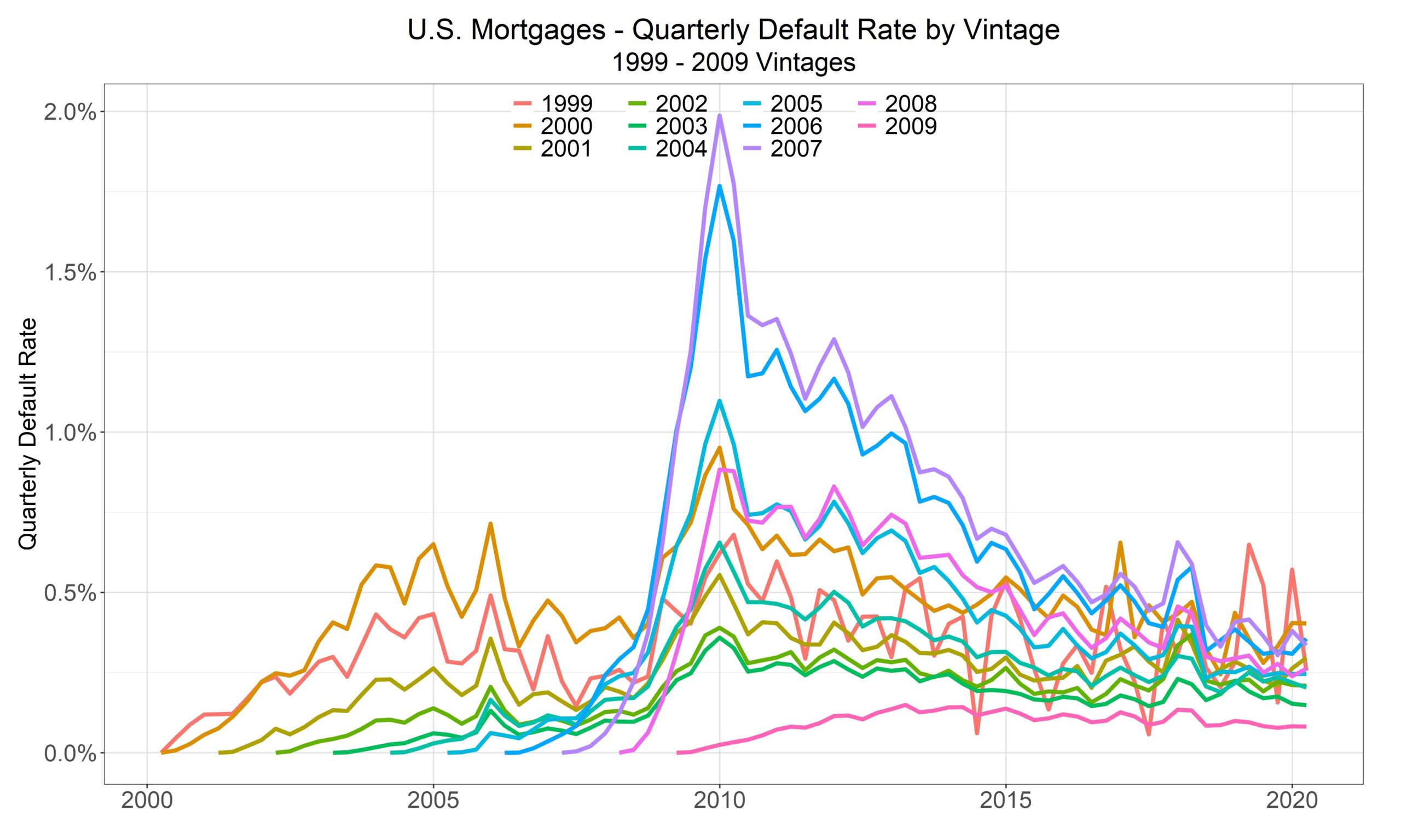
Let’s repeat that for emphasis. Prior to 2020, quarterly default rates for every available pre-Crisis vintage, dating back to 1999, peaked at the same time.
Now, our first two default rate graphs are a bit noisy, so let’s look at default counts, which provide a cleaner illustration of how the vintages perform. (We’ve dropped the 2009 vintage from this graph, so the colors have changed from Graphs 2 and 3.)
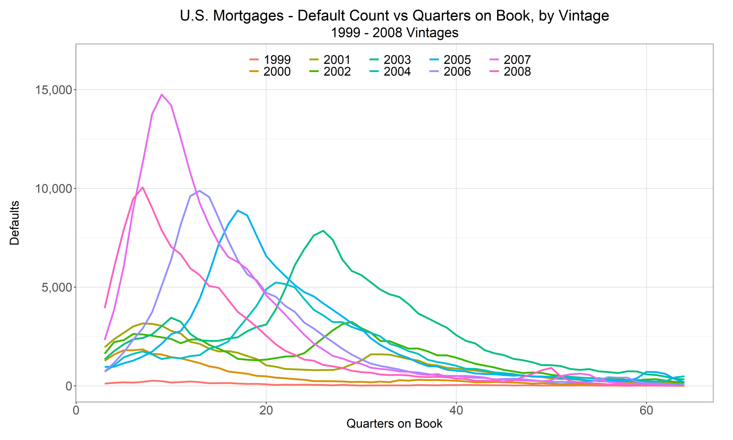
Again, these are counts, and Fannie’s pre-Crisis vintage size by loan count (and by balance) varied, a lot. The worst performing vintages by count (and rate) were much smaller than some of the previous vintages, e.g., 2003 has a relatively high default count, but at origination, its loan count was more than three times the size of the later vintages, and balances were proportionally bigger, too, so you’ll see that if you compare Graph 4 with Graph 2.
We can sharpen our point, further, by looking at cumulative default rates versus QOB. This view separates the vintages cleanly.
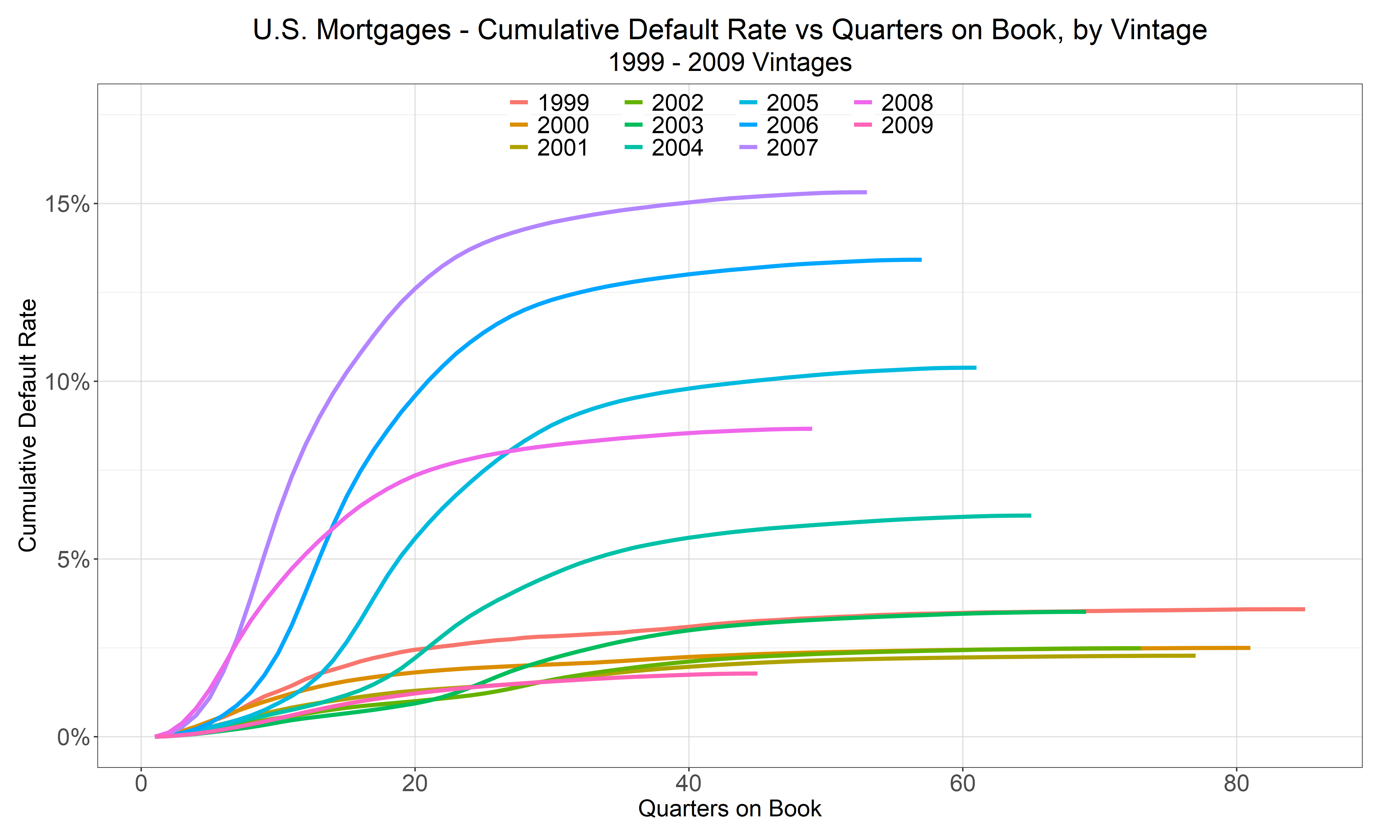
Yep. A few very bad vintages, where highly-leveraged loans were made to unqualified borrowers at peak home prices. (See our article on Fort Myers, for an example) The music stopped, so-to-speak, before those loans paid off. Now, there’s obvious endogeneity here: making very risky loans raised the likelihood of a severe downturn in the first place, but whatever cause, those loans were only exposed once the downturn arrived and fed on itself (as a vicious cycle of declining prices and increasing foreclosure rates). Had home prices kept rising, the bad vintages would have had higher losses than the earlier ones (in a parallel way) but not as massive humps.
Let’s summarize. So far, we’ve shown that for pre-Crisis vintages, TOB default curves have little to do with the idiosyncratic risk of loan age and a lot to do with systemic risk. It’s not hard see, and it’s clearly visible, and has been so since the early 2010s. All pre-Crisis vintage default rates, regardless of the loans’ ages, peaked at the same time, which is why The Crisis is called “The Crisis.”
Now you might ask, “What about post 2009? What happens there? Are you trying to hide later evidence that doesn’t support your proposition?”
Post-Crisis
Well, no. In fact, we’re sorry to say that post-Crisis looks even worse for TOB fans.
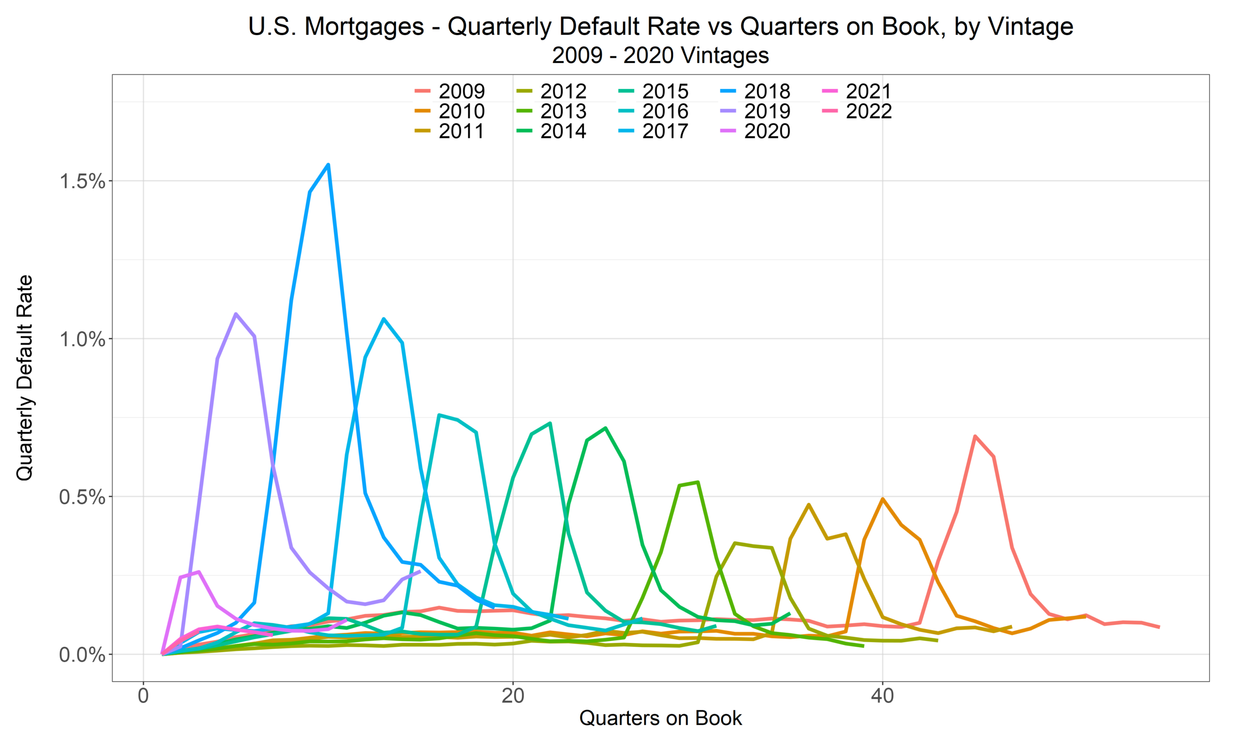
Graph 6, shows that the default rate peak for each post-Crisis vintage is about four quarters later in its life that its next youngest neighboring cohort: 2009’s peak is around 11 years of age, 2010’s around 10 years, 2011’s around nine years, and so on. So, for post-Crisis vintages it is even more obvious that TOB doesn’t work as an explanatory variable for credit defaults and losses.
Now what caused all of the vintages to have peak default rates in the same quarter (or so)? Hmmm, what could it be?
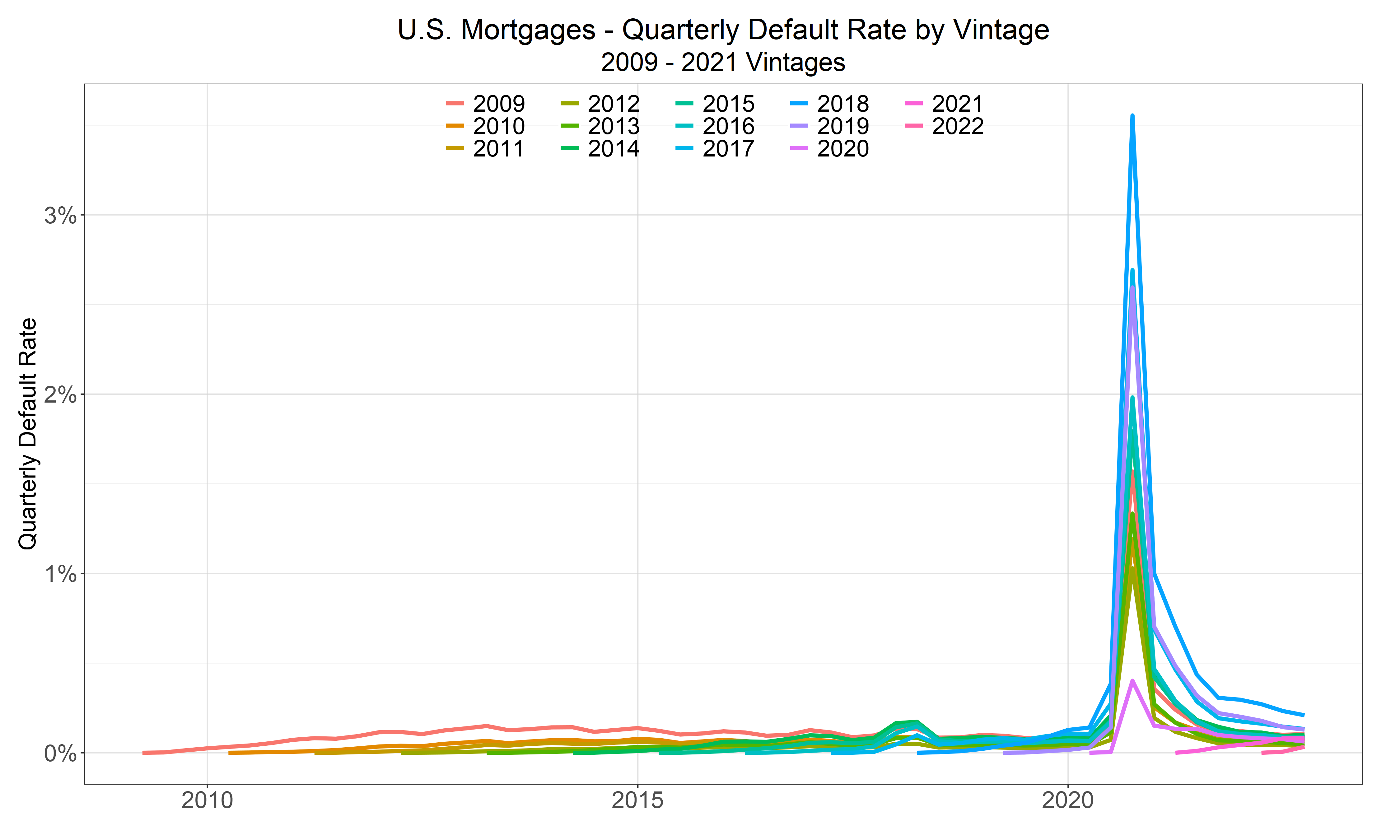
That’s right, there was something called, “Covid.” Again, systemic risk—this time government-imposed (as opposed to The Crisis, which was government-abetted with its early 2000’s affordable housing policies) cause all vintage default rates to peak at the same time.
Notice also that when the curves aren’t peaking, the default rates are very similar—all close to zero and all relatively flat.
It’s worth a lengthy aside to note that some people would say that because the lines are flat, their correlation coefficients are undefined, 0/0, so those lines aren’t statistically related. That’s technically true, and it misses the point. The flat rates are logically and mathematically and in actuality related. Fix FICO, DTI, updated LTV, and your other risk variables, and each good-time default rate is flat, almost by construction. That’s not a statistical fact that can be estimated; it’s how loans behave in good times. A correlation coefficient is just the wrong instrument to try capture the closely-related behavior.
If analysts only have a statistical hammer, and calculate before thinking, they’re likely draw the wrong conclusion (that a several lines with no slope, occurring at the same time, are unrelated). So, take Dickens’s advice, and be wary of such boys, for on their brows is written “Doom.” They might be earnest, industrious, and confident, but their logic is flawed, which makes their ignorance and their analysis dangerous and misleading. Prior to The Crisis, the same type of boys who understood their thin-tailed MBS models but didn’t grasp fat-tailed reality (and so missed the difference between the two) helped cause The Crisis. Today, as a test, give their progeny a set of unordered x-y coordinates that form a perfect circle. If they tell you that there is no relationship between the x’s and y’s because the correlation coefficient is zero, then you’re dealing with someone who is mechanical, not thoughtful. AI, at its most literal, frequently makes the same mistake; it has on several occasions with us; so, be careful with both.
And Furthermore
Pre- and Post-Crisis Averages
Now, let’s look at the average default rate against quarters on book for pre- and post-Crisis groups of vintages, i.e., the average for those loans originated 1999 through 2009 versus the average for those originated 2010 through 2019.
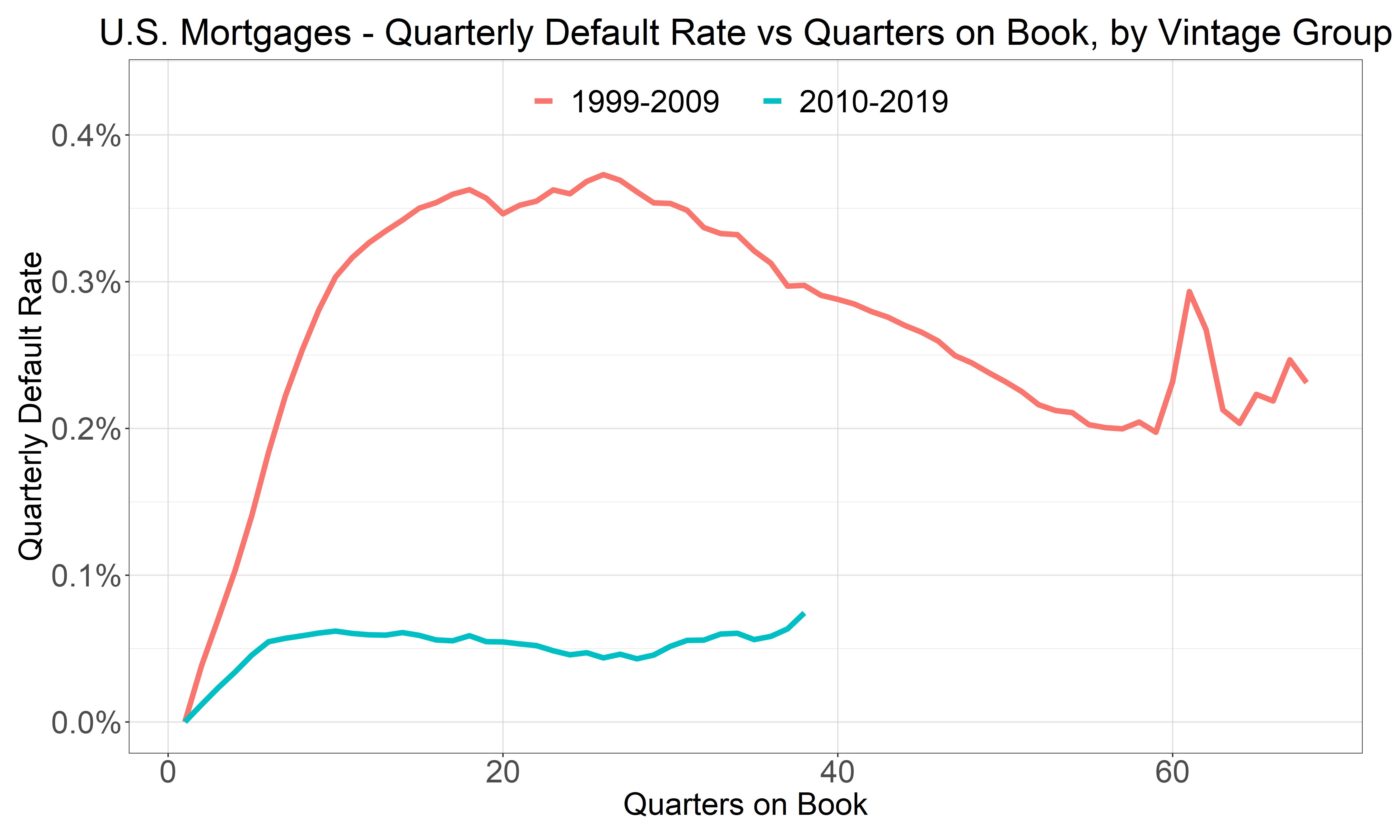
If loan age were the driver, the two curves would have similar shapes and levels, because TOB says that a loan is a loan. Aging is aging, but… the curves are not the same. In fact, one is basically a flat line, not too far from zero.
The difference is that pre-Crisis performance contains a crisis, and post-Crisis doesn’t. The average default rate of the 1999 – 2009 group peaks at about 0.37%, after about six years (on average). The average of the 2010 – 2019 group is nearly flat—at around 0.06%, because, again, since The Crisis, times have been pretty darn good: relatively low rates and an ocean of liquidity that greatly inflated home prices. (If you’re building loss forecasting models without considering regimes, you’re not going to capture what matters.) The logic is simple, in good times, there’s no reason to default if you can’t pay your mortgage; sell your home for a profit, instead. Even with foreclosures, lenders tend not to lose for the same reason.
Wrong Models and Failed Back-Tests
If you were in the business and had happened to have built a TOB seasoning model in the early 2010s, using the earlier, pre-Crisis regime, and then used that model to forecast future losses, consider the implications. Every forecast cycle, your model would predict a peak that never arrives. Even if the curve were adjusted for macroeconomic conditions, it would over-predict defaults, year after year, because the model encoded a calendar event as a law of loan age. That’s a prime example of a categorical error, and, heck, should be presented in stats and finance textbooks. When used in forecasting, it waits for the event to recur but on the wrong clock, i.e., loan time, instead of economy or calendar time. A model that fails out-of-sample like that isn’t unlucky. It’s mis-specified. Credit is all about regimes (and making sure that your models accurately capture the effects of those good times and bad times on losses).
Do note that we’re not applying 20/20 hindsight, and we’re not claiming anyone could have predicted the last crisis nor that anyone can predict the next one, and that’s the point. When using a model based on TOB, forecasted losses in good times are likely to be overstated, and forecasted losses in bad times (or crisis times) are likely to be understated for the same reason—because you’re shifting an average curve up or down, where that average curve is a very specific historical artifact that captures neither good times nor bad times—like an all-seasons jacket that will leave you shivering in January and sweltering in late July.
What we are claiming is that even in the early 2010s, it was clear that a vintage’s default rate wasn’t simply a scalar or function of the average relationship defaults as a function of loan age. To see that this fact was obvious in, say, 2013, truncate any of Graphs 2 – 5 in that year. Defaults (and losses) for all vintages peaked at the same time. We’ve shown that. That means loan age is irrelevant.
And that is what is worse; there was/is no reason to look at the average relationship when better, easier, more intuitive, more fundamental factors were (and are) available. The failure wasn’t a failure of prediction. It was a failure of looking, i.e., a failure of the scientific method—what we at Spero Risk call, “Thought before calculation.”
In sum, the artifact was diagnosable in real time. During the CCAR/stress testing model-building panic of the early 2010s, the categorical error might have been defensible, it hasn’t been for at least a decade. Losses were and cannot be known before they occur—and we’re not pretending otherwise. We don’t know the future. No one does. What we do know is that conditional expected losses can be derived more cleanly and justifiable by replicating conditions similar to downturn, rather than average good times and bad times.
Losses, too—Not just Defaults
For the still skeptical reader who believes that we’re attempting some sleight-of-hand by focusing on defaults, rather than losses, please consider Graphs 9 & 10: pre-Crisis and post-Crisis vintage Net Charge-off (NCO) curves. (We’re showing pre-Crisis in calendar time to highlight The Crisis.)
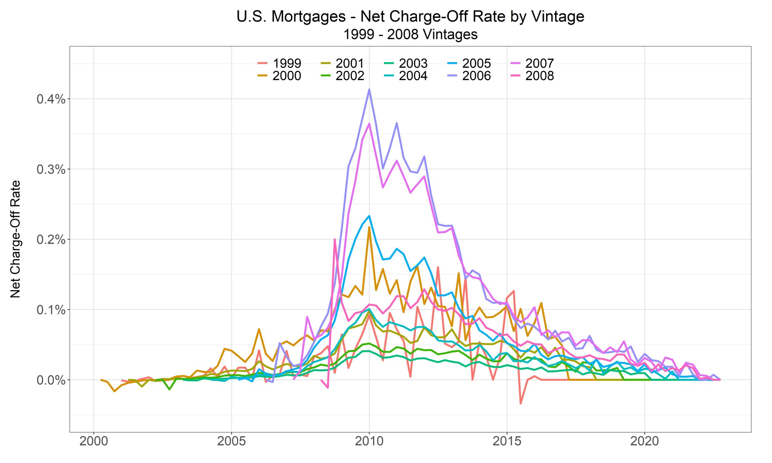
The pattern of pre-Crisis losses in Graph 9 looks very similar to default rates, and actually strengthens our claim. Notice that the early vintages have low loss rates because even if they had early defaults, the home prices had risen enough to recover balances for defaulted loans. (Good times hide a lot of sins.)
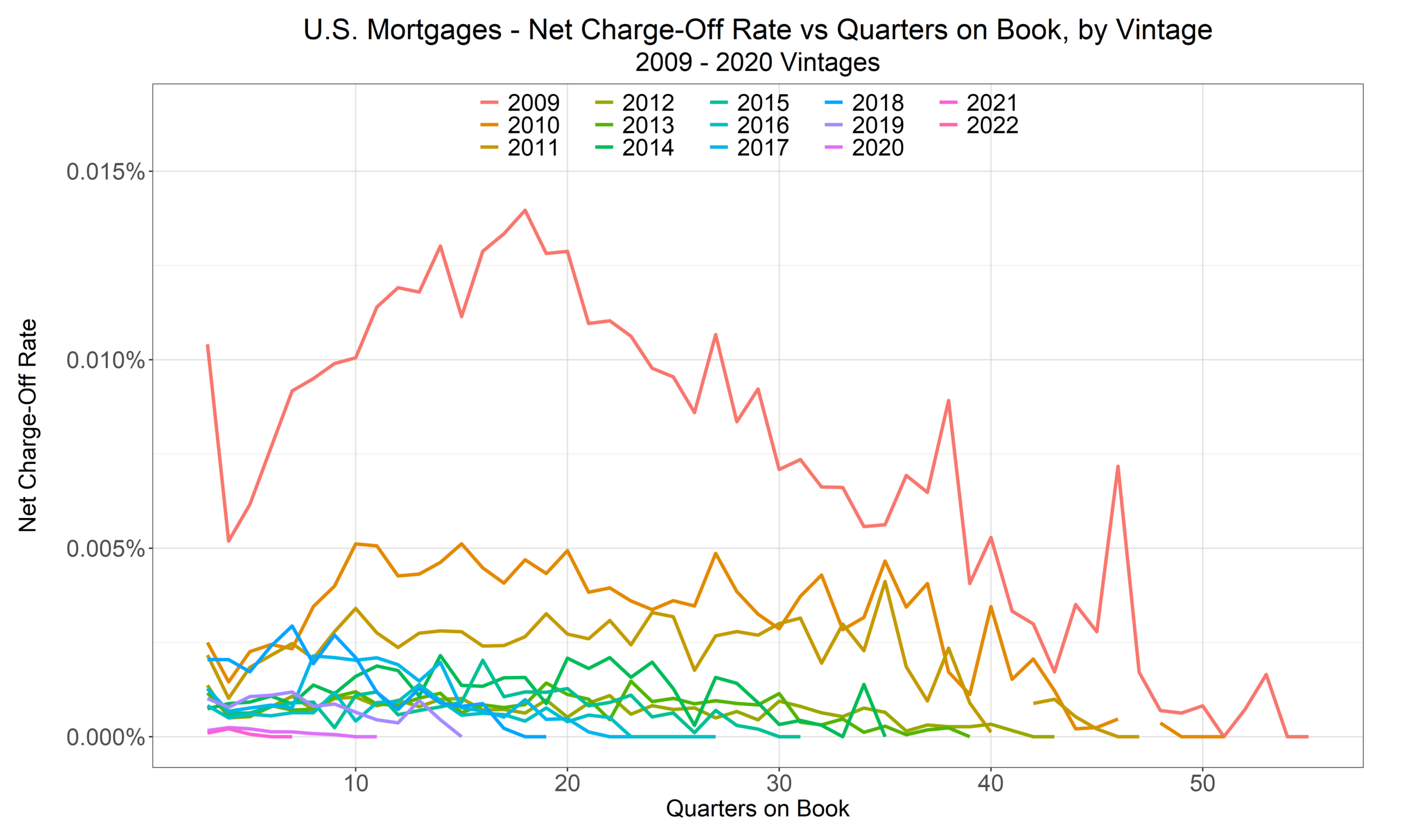
Before the dear reader says, “Wow, look at how those 2009 vintage losses spike in that graph,” we ask him or her to note the scale. That’s 1.5 basis points on the vertical axis. Low interest rates, oceans of liquidity, and rising asset prices hide a lot of sins. (Yes, we say that, a lot.)
Age Is a Proxy, Not a Cause
On its own, loan age has no causal content, and it’s less transparent than what it tries to proxy. It stands for some concoction of updated LTV, the interest rate regime, a datable event like a rate reset, cohort survivorship, etc. Its meaning is so conditional (on so many different factors) that it can be downright misleading. Leonardo said, “Simplicity is the ultimate sophistication.” He said nothing about simplistic, misleading measures. You can do better. (We can help you.)
The peaks we saw above appear because origination vintages cluster in time relative to the more primitive economic conditions: during low rates and home price appreciation, more borrowers borrow or refinance, and then during sharp home price declines or spikes in unemployment, defaults occur. This makes age collinear with the calendar by construction. If you put age on the axis and average across vintages you will always find an age effect if something systemic happened, like The Crisis or like Covid. (If not, they’ll be flat lines.) That age effect will be based on the weighted-average age of the portfolio and the severity of losses at the time of the event. The method manufactures it but doesn’t really represent anything portable and reusable.
An easy way to see this is that in good times, mortgages lose basically nothing; so, bad times are going to contribute all of the magnitude to any average loss, but as we’ve shared in our various posts on regimes, that historical average loss describes nothing useful, and here, at any portfolio date, certain vintages comprise more of the portfolio than other—sometimes older—vintages; so, you’ll get an age effect… if something happens to happen.
This misinterpretation hits hardest exactly where the industry relies on it most—for amortizing, secured loans where the collateral state is observable. There, what a seasoning term gropes at is better captured at its source; amortization, prices, and the equity path are part of updated LTV. Selection and burnout are in the prepayment model—and that effect is interest-rate regime-dependent, not a fixed function of age. Recently, in a rising-rate world, borrowers with low fixed coupons are locked in and are not prepaying; so, if a crisis were to re-occur, older, early Covid loans would likely lose, a lot. Contractual resets for certain types of loans are datable events; investigate (and then model) those events, and you’ll see different pre- and post-event behaviors, because of the event, not because of when the event occurs in the loan’s lifespan. There’s no need to confound yourself with the loan’s age. Put another way, and all else equal, in a home price crash, a five-year-old mortgages with an updated LTVs of 150% will perform just as poorly as two-year-old mortgages with an updated LTVs of 150%.
Conclusion: What to Model Instead
When the state is observable, model the state. The age term only confounds.
None of this means default timing doesn’t matter. What it means is that the time reference matters. A model anchored to origination date can only replay the average timing of the specific crisis or crises in its sample. It can’t reprice for a downturn that arrives on a different schedule, because its risk clock is welded to the wrong reference point. And that’s a huge problem today, in 2026, when the riskiest cohorts were originated at peak Covid prices and are now three-to-five years old and aging, not prepaying.
A well-built model anchored to the state of the loan—updated leverage, the rate regime, the equity (price) path—adapts to whatever you hand it.
There’s a warning in the flat lines of modern vintages, too. Fit a seasoning curve on the last decade alone and you’ll conclude that mortgages barely default and that when they do, they lose even less. You’ll be right—until the regime turns. The flat curve isn’t evidence of safety. It’s evidence that the bad-time regime hasn’t arrived. Mistaking the one for the other is how good-time data fools many credit practitioners. Considering risk as a function of time-on-book will never catch the obvious risks. Put another way, who would use a TOB seasoning curve that shows maximal default rates somewhere from 12 years TOB (for the 2008 vintage) to 21 years TOB (for the 1999 vintage), like the graph below shows? Graph 11 is Graph 3 extended a few additional years to include Covid. (And bad developers would say, “No, no, no. That’s Covid, I’d dummy it out.” Why? Because the double spike doesn’t fit their preconceived notion of what seasoning curve should look like, e.g., Graph 1).
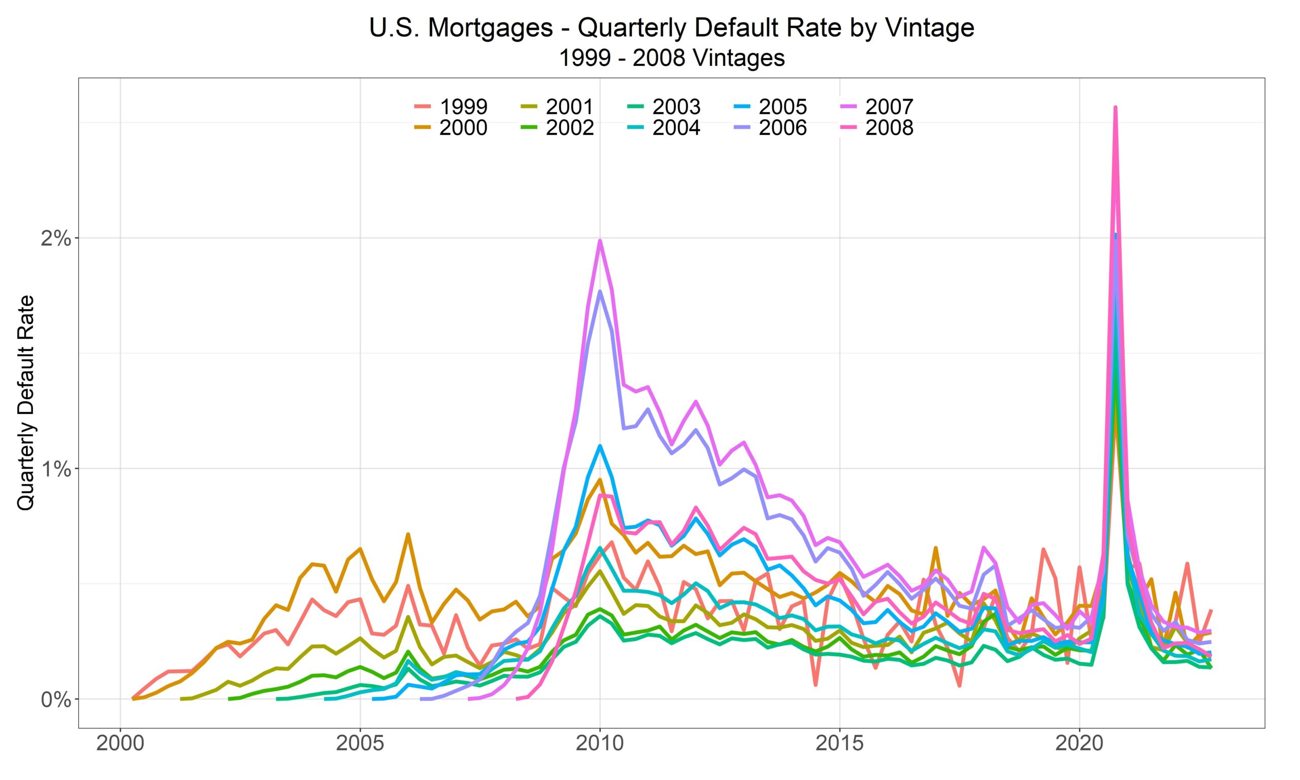
It’s obviously nonsense, here, and it’s just as much nonsense when it’s not as obvious.
Appendix: All Vintages, Defaults by Quarters on Book