In this article, we investigate portfolio strata from our recent article, “Fort Myers Mortgage Risk: A Repeat of The Crisis Would Be… a Crisis?”, and show that 10% of the loans generate almost 50% of the expected losses.
The inestimable Mark Steyn has a great analogy for how a little of something very bad can ruin the whole: when making a milkshake with vanilla ice cream, add any amount of dog poop, and mix. It will taste more like the latter than the former. We’ll show how that rule holds for lending portfolios, including our focus, here, on Fannie Mae mortgages in Fort Myers.
1. A Review of Mortgage Losses in Fannie’s Fort Myers Portfolio
Tighter mortgage underwriting standards are supposed to prevent a reoccurrence of the GFC. To test that, we estimated losses in Fort Myers, FL, where home prices fell 57% during the GFC and where they’re already down 10% from their 2023 peaks.
We focused on single-family residential mortgages owned by Fannie Mae because that loan data is publicly-available—unlike FHA loans—and estimated losses assuming a further 47% drop (from 2023) to match the 2006 – 2011 peak-to-trough drop (of 57%).
Fannie’s portfolio as of Q2, 2025 was the latest one available when we started our work, so that’s what we use. We compared it to the same portfolio as of Q1, 2007, when the local HPI was also down about 10% from its previous 2006 peak.
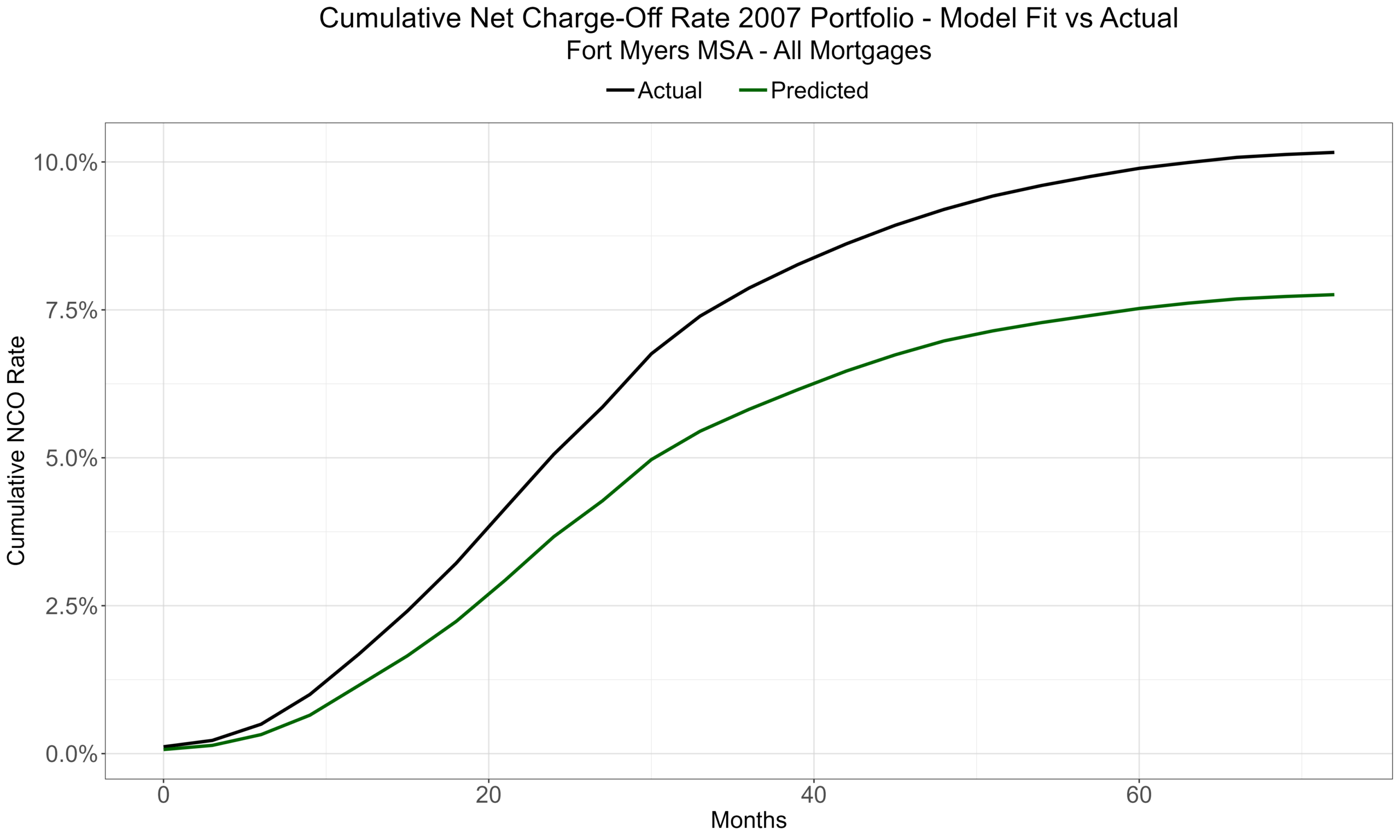
Our six-year, forecasted, cumulative loss rate is ~8.6%, which was less than the GFC’s realized 10.3% loss rate on the 2007 portfolio, but still shockingly high, don’t you think? Moreover, we offered several reasons why ~8.6% might be low, i.e., there are adverse circumstances today that weren’t present in 2007, including a greater prevalence of FHA loans, which are the new sub-primes. FHA is effectively subprime with better documentation: 3.5% down, DTIs pushing 50%, and credit scores well below conventional floors. The catch is an asymmetry that should worry every conventional lender in the market: the credit losses on those FHA loans are guaranteed by the government, but the externalities of FHA foreclosures are not: the destruction of neighboring home values, which is true collateral damage. Those foreclosures become the comps that drag down the conventional homes—like the ones in Fannie’s portfolio—sitting on the same streets, just a few houses down.
2. Where Do the Losses Arise?
In our first article, we analyzed relevant risk characteristics (that were available in the data set) and explored differences in those factors between the 2007 and 2025 portfolios. We illustrated those differences in a series of 2D graphs to show how the expected losses would arise. This rotatable 3D image captures the effects of two of the factors: origination FICO scores and LTVs at the portfolio date. Notice the clear convexity with respect to (w.r.t.) leverage and the less visible, but still present, convexity w.r.t. FICO scores. The combination is deadly, i.e., the lowest FICO scores and highest leverage generate expected loss rates of above 30% (in a repeat of the downturn, of course). It’s a beautiful scatter plot—if a bit scary, and as we’ll explain we’re convinced we’re understating expected losses.
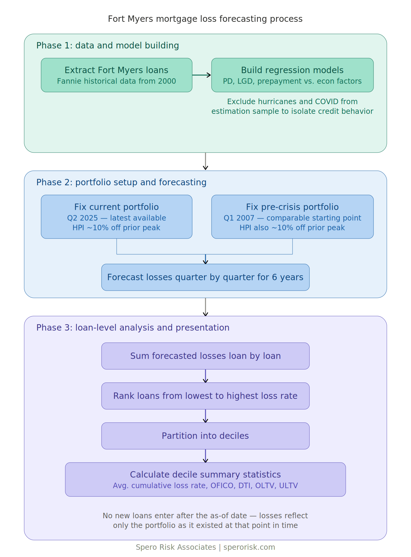
To explore the risk factors and their implications on multiple dimensions, we partition today’s portfolio into deciles—first by expected loss rates and then later, for historical comparison, by loan-to-value ratios. (See the Appendix for an overview of the process.)
3. The Beauty and Shock of Expected Losses
We calculated expected losses for each loan in 2025’s $8.6B portfolio, ordered the loans from low-to-high by their expected loss rates, grouped those loans into deciles, and calculated mean risk factors for each decile—balance weighted for EL and count-based for the others—as shown in Table 1.
| EL Rate Decile | Starting Balance ($M) | Expected Losses ($M) | Expected Loss Rate | FICO | DTI | Start of Forecast ULTV | OLTV |
|---|---|---|---|---|---|---|---|
| 1 | 342 | 0.19 | 0.05% | 784.62 | 32.1% | 17% | 59% |
| 2 | 510 | 1.03 | 0.20% | 778.94 | 34.6% | 26% | 61% |
| 3 | 647 | 2.87 | 0.44% | 770.32 | 35.8% | 35% | 64% |
| 4 | 748 | 6.54 | 0.87% | 763.69 | 35.8% | 41% | 67% |
| 5 | 830 | 12.96 | 1.56% | 759.21 | 37.0% | 48% | 72% |
| 6 | 897 | 25.30 | 2.82% | 752.69 | 37.3% | 54% | 76% |
| 7 | 960 | 49.07 | 5.11% | 749.11 | 37.8% | 62% | 78% |
| 8 | 1,107 | 100.13 | 9.05% | 750.70 | 38.4% | 73% | 79% |
| 9 | 1,218 | 188.70 | 15.49% | 744.25 | 39.9% | 83% | 83% |
| 10 | 1,328 | 349.45 | 26.32% | 726.59 | 42.0% | 96% | 90% |
Start of Forecast ULTV reflects home prices already down ~10% from their 2023 peaks. Prices decline a further 52% from the 2025 start values, which is an additional 47% from the peak to match the earlier decline of 57% from 2006 – 2011.
Notice the (almost complete) monotonicity as you go down the rows as well as the convexity—the increasing differences between (in the columns that matter). It’s a beautiful table. Except for Decile 7’s (D7’s) FICO score and D4’s DTI percentage, every column is strictly monotonic, in the way that an informed reader—and maybe even a casual reader—would anticipate. (Note: we’re scrupulously honest and could have hidden the two, small monotonicity deviations by rounding up, they’d still be in the results.)
Balances increase by decile (as you work your way down the table), and both losses and loss rates are increasing and convex. (Loss rates (and losses) have to be increasing—that’s how we constructed the tablebu—but they didn’t have to be convex.)
The best decile, D1, loses about 5 basis points (BPS) over six years—less than a basis point per year in a 57% price crash—and the worst, D10, loses over 26%, which is 481 times D1’s loss rate! D10’s balance of $1,328M is nearly four times D1’s balance of $342M for the same number of loans. In fact, the imbalance—highest balance and highest expected loss rate—is so great that the worst decile generates about 48% of our total expected losses of $736M, whereas D1 generates 0.025% or 2.5 BPS of the overall expected loss. That ain’t a chocolate milkshake being served.
D1 has the best average risk characteristics: the highest average (and best) FICO score, the lowest (and best) average Debt-to-Income (DTI) ratio, and the lowest (and best) average Loan-to-Value (LTV) ratio.
We can infer that D1’s loans tend to be older—originated before the massive Covid price runup—and we can infer that the loan get younger as we go down the rows. You can see this by considering the difference between average LTV at origination, OLTV, versus its updated value at the portfolio date, ULTV. For example, for D1, the difference between its OLTV of 59% and its ULTV (at portfolio date) of 17% is 42 percentage points. That difference decreases for each decile until it is -6% for D10 (90% – 96%). Note that the -6 means that, on average, D10 home prices have declined since origination.
Likewise, D10 has the worst average risk factors and is the only decile where updated LTV is higher than at origination (and is a very high 96%). That’s why its 10% of the loans generates almost half of the expected loss, and it should make sense; that’s roughly how the loss-forecasting models were built.
Most D10 loans were put on at peak home prices and carried the most leverage—that’s the only way the borrowers could afford to buy when home prices were at their peaks. As we explained in the original article, Private Mortgage Insurance (PMI) coverage, which increases with OLTV, when OLTV is over 80%, isn’t enough to compensate for a 57% price decline from origination, especially if the loan was booked during the frothiest time in the market. (BTW, we’re underestimating losses because we know which loans started with PMI, but we don’t know if any borrowers have dropped it; so, we keep it in place. That’s another reason our surprisingly high loss estimates are likely the underestimate losses.) D10 has the lowest FICO scores, highest DTI ratios, and the most leverage: what could go wrong? Nothing, unless home prices start to decline. But that could never happen, could it?
Now that we have a sense of where losses would be generated in today’s portfolio (if prices were to decline like they did 20 years ago), let’s compare those expected losses to 2007’s actual losses. (To be precise, we’re looking at the losses realized on Fannie’s Q1 2007 portfolio, only, and not any losses generated during the GFC on loans booked after that quarter. That allows us to keep our comparison clean; we don’t have to forecast new loan balances.)
4. Comparing 2025 Expected Losses to 2007 Real Losses
We can’t use deciles based on expected loss rates to compare 2025’s expected performance to 2007’s actual performance. If we did, with a historical default rate of a little over 20%, eight of 2007’s ten deciles would have zero losses, and there would be no way and no need to rank the bulk of the portfolio. However, we can form deciles based on LTV, which as we saw above and in the earlier article, is strongly related to losses. Re-ranking 2025 by ULTV decile doesn’t change the view too much:
A. 2025 by LTV Decile
| ULTV Decile | Starting Balance ($M) | Expected Losses ($M) | Expected Loss Rate | FICO | DTI | Start of Forecast ULTV | OLTV |
|---|---|---|---|---|---|---|---|
| 1 | 277 | 0.36 | 0.13% | 765.71 | 34% | 13% | 58% |
| 2 | 501 | 1.53 | 0.30% | 765.15 | 36% | 25% | 59% |
| 3 | 636 | 3.86 | 0.61% | 762.49 | 36% | 34% | 64% |
| 4 | 748 | 7.66 | 1.02% | 760.90 | 36% | 42% | 69% |
| 5 | 832 | 15.68 | 1.88% | 760.11 | 37% | 49% | 73% |
| 6 | 891 | 27.32 | 3.07% | 756.11 | 37% | 55% | 76% |
| 7 | 958 | 52.24 | 5.45% | 752.68 | 37% | 62% | 79% |
| 8 | 1,077 | 105.27 | 9.78% | 750.07 | 38% | 72% | 78% |
| 9 | 1,267 | 185.19 | 14.62% | 754.97 | 39% | 84% | 81% |
| 10 | 1,403 | 337.14 | 24.04% | 751.92 | 41% | 101% | 92% |
A few points to notice:
- Expected loss rates are slightly compressed: the worst ULTV decile is “only” 187 times greater than the best (versus 481x in Table 1).
- The FICO score range is much more compressed and loses Table 1’s (near) monotonicity, where the best-to-worst difference was 58 points. Here, it’s only 14 points. (BTW, that’s what gives FICO some explanatory power versus the other risk factors; you want your parameters to be orthogonal to each other to explain residual errors.)
- D10’s average starting LTV is now underwater, and that’s before the additional 52% price decline. Balances in the worst decile are now over $1.4B.
- With the slightly lower loss rate but more balance, D10, based on ULTV, still contributes 46% of overall losses versus about 48% in Table 1’s view.
Let’s look at 2007’s actual losses ranked, again, by ULTV at the portfolio date.
B. 2007 by LTV Decile
| ULTV Decile | Starting Balance ($M) | NCO ($M) | NCO Rate | FICO | DTI | ULTV | OLTV |
|---|---|---|---|---|---|---|---|
| 1 | 159 | 4.70 | 3.0% | 751.43 | 30% | 14% | 38% |
| 2 | 195 | 0.33 | 0.2% | 743.56 | 32% | 24% | 50% |
| 3 | 209 | 0.56 | 0.3% | 735.20 | 32% | 30% | 59% |
| 4 | 227 | 2.08 | 0.9% | 731.77 | 33% | 35% | 66% |
| 5 | 253 | 2.71 | 1.1% | 728.72 | 33% | 39% | 70% |
| 6 | 268 | 6.33 | 2.4% | 725.84 | 35% | 44% | 72% |
| 7 | 295 | 15.21 | 5.2% | 724.28 | 37% | 50% | 73% |
| 8 | 327 | 33.30 | 10.2% | 716.74 | 38% | 59% | 70% |
| 9 | 389 | 75.28 | 19.4% | 709.67 | 39% | 70% | 74% |
| 10 | 434 | 130.20 | 30.0% | 720.81 | 40% | 83% | 83% |
The portfolio was only $2.7B in 2007, which is 32% of today’s balance. In addition, balances by decile show less variance than 2025’s: D10’s balance is only 2.75 times greater than D1’s balance versus 5x for 2025 in Table 2. FICO bands are clearly worse in 2007 than 2025, with the average of the best ULTV band in 2007 lower than nine of the ten deciles in 2025. As we’ll see, depending upon how you measure it, DTIs are arguably worse.
What is genuinely surprising is that both origination and updated LTVs look better in 2007 than 2025, but the average loss rate in D10 is 30%! (BTW, recall that 2007’s overall, cumulative, loss rate was 10.3% versus our guess of ~8.6%, now.) So, one way to look at it is that 2007 had worse borrowers but better loans (based on LTV). Who says underwriting standards are better (or, at least, uniformly better) today?
You may have noticed that the loss rate for 2007’s lowest LTV decile is higher than the loss rates for the next five deciles. That’s not a mistake. We think it’s a data quality issue, i.e., some D1 loans seem to have inaccurate LTVs and those loans were much more likely to default and had losses given default (LGD) rates like the D9 and D10 rates—the deciles with the highest leverage. Further evidence of underwriting errors or downright fraud, include:
- Recovery rates indicate that D1 foreclosures sold at prices comparable to homes with a starting ULTV of 70%.
- Some D1 foreclosures had PMI proceeds, which shouldn’t be possible if their LTVs were accurate; it’s only needed when OLTV is greater than 80%.
- Some D1 foreclosures had proceeds from repurchase/make-whole agreements, which suggests that Fannie was able to prove the underwriting information was inaccurate and demanded cash from the loan originator.
This is probably as good a place as any to mention that our analysis is quantitatively conservative for another reason: our LTV estimates are based solely on first mortgages, held by Fannie, and don’t include combined leverage for second mortgages and home equity loans borrowed after the origination date, and as we’ve seen—and should be no surprise to anyone—greater leverage increases risks. (More on our conservatism, below.)
C. 2025 – 2007 Differences: Separating Borrower & Loan Characteristics
Let’s look at the cell-by-cell differences between 2025 and 2007 deciles, which allow us to refine a few of these points.
| ULTV Decile | Starting Balance ($M) | 25 EL vs ’07 NCO ($M) | EL Rate vs NCO Rate | FICO | DTI | Start of Forecast ULTV | OLTV |
|---|---|---|---|---|---|---|---|
| 1 | 118 | -4.35 | -2.83% | 14 | 4.05% | -1.2% | 20.0% |
| 2 | 306 | 1.20 | 0.14% | 22 | 3.64% | 0.6% | 9.0% |
| 3 | 426 | 3.30 | 0.34% | 27 | 3.21% | 4.0% | 4.8% |
| 4 | 521 | 5.58 | 0.11% | 29 | 3.58% | 6.9% | 2.5% |
| 5 | 579 | 12.97 | 0.81% | 31 | 3.50% | 9.3% | 2.8% |
| 6 | 622 | 21.00 | 0.71% | 30 | 2.35% | 11.4% | 4.1% |
| 7 | 663 | 37.03 | 0.29% | 28 | 0.89% | 12.3% | 6.5% |
| 8 | 750 | 71.96 | -0.41% | 33 | -0.47% | 13.4% | 7.4% |
| 9 | 878 | 109.90 | -4.74% | 45 | -0.32% | 14.6% | 6.7% |
| 10 | 969 | 206.94 | -6.00% | 31 | 1.00% | 17.3% | 9.5% |
| Totals | 5,833 | 465.53 | |||||
| Average | -1.16% | 29 | 2.14% | 8.8% | 7.3% |
On average, across the deciles, borrowers in 2025 have FICO scores about 30 points higher than in 2007. That could be because of (1) tighter lending standards and/or (2) changes in FICO scoring through time, e.g., if FICO model revisions boosted credit scores through time.
However, the average DTI for recent borrowers is about two percentage points higher than for 2007 borrowers, and higher is not better. The DTI column reveals that 2025’s DTIs are worse than 2007 in the deciles with the lowest loss rates. So, while DTI’s are slightly worse today, their contribution to losses is small.
Together, 2007’s borrowers is one reason why its default rate is about 10% greater than 2025’s forecasted rate… kind of. Some factors affect forecasted probabilities of default, losses given defaults, and balances (via prepayments) in our models; so, the net effect is hard to detangle.
Where the 2025 portfolio looks worse than 2007 is our estimate of leverage. After a ~10% decline in home prices, the current portfolio is substantially more levered than the earlier portfolio, and it’s exactly where you don’t want it to be: in the deciles with the highest LTVs since that’s what drives loss rates. Look at the Start of Forecast ULTV column, i.e., LTV at the portfolio date. The per decile, average is 9 percentage points higher today, and the five worst-performing deciles all have double-digit differences, maxing out at 17% for the worst decile. (It’s worth noting that offsetting this is the suspicion that pre-2007’s appraisals were overstated, especially for refinancings.
So, how today’s portfolio could lose money at a rate close to the GFC rate, despite “stricter” underwriting standards, it’s in the leverage; proportionately more of today’s portfolio was originated at high LTVs at peak prices. The difference is worst for the highest LTV deciles—exactly where you don’t want it to be. So, expected default rates are slightly lower, but expected loss given default (LGD) rates are higher on the deciles with the largest balances and with the highest default rates. See the first article for why.
Good times hide a multitude of sins. Rising prices cure every underwriting defect: as long as the collateral appreciates, a bad loan never shows a loss, because the foreclosure sale covers the balance. That’s exactly what happened for the last fifteen years, and it’s why the leverage in today’s book went unnoticed—like the old boiling frog analogy. A price decline doesn’t create the risk; it simply reveals what’s there.
5. How We’re Conservative
A good loss forecast makes predictions that align closely with both past and present facts while using proven, evidence-based methods. Conservative, then, doesn’t mean padded, because a padded number fails as much as an optimistic one does; it fails to illuminate and is useless for risk management purposes.
For this analysis, conservatism means that where we had to choose, we chose assumptions, methods, and results that produced lower losses. We did that to avoid any claims that we exaggerating/scaremongering/overstating/sensationalizing, etc.
- Our prepayment models are slightly conservative; we overstate prepayments and forecast lower balances; so, less available to lose.
- Our PD models are slightly conservative; we understate PDs and forecast fewer defaulted dollars; so, less available to lose.
- Our LGD models are very conservative; we understate LGD rates and forecast lower loss severities; so, less lost.
Our conservatism causes our forecast of the 2007’s cumulative loss rate to be about 240 bps below the actual loss rate. So, yeah, we are purposely not trying to overstate forecasted losses, and yet… (As we’ve mentioned, there are a host of other, adverse, qualitative factors that are present this time that weren’t present in 2007.)
6. Conclusion
Conventional wisdom seems to be that we couldn’t have a repeat of the GFC because Government Sponsored Entities (GSEs) and banks have tighter lending standards now. That’s an argument about whether the probability of a real-estate crash is different—read, lower—in 2026 than in 2006/07. We’re not directly arguing that here, but for several reasons, we do think it’s a debate worth having, e.g., at least in Fort Myers and by the measures available to us, leverage is worse today.
So, instead of focusing on the likelihood of a crash, we focused on the severity, and asked and answered, “What if home prices decline, like they did back then, what could be lost?”
Based solely on our statistical methods and forecasts, our ~8.6% loss rate comes in below the 10.3% that the 2007 portfolio actually realized, again with substantial evidence that our loss estimates aren’t inflated. Before anyone takes comfort in that, consider the benchmark. Nationally, home prices fell about 19% in the GFC and Fannie lost about 4.7% on its single-family book, and that was a national crisis.
Even with today’s tighter underwriting standards in one metro area, our forecast is nearly double that rate.
Our question to the reader: if home prices were to follow a similar path, would an ~8.6% loss rate qualify as a crisis, and would you be okay with that?
P.S. Nationally, for reasons different than last time, a downturn like the last one, most certainly would be worse. If you’re interested why, please contact us.
Appendix